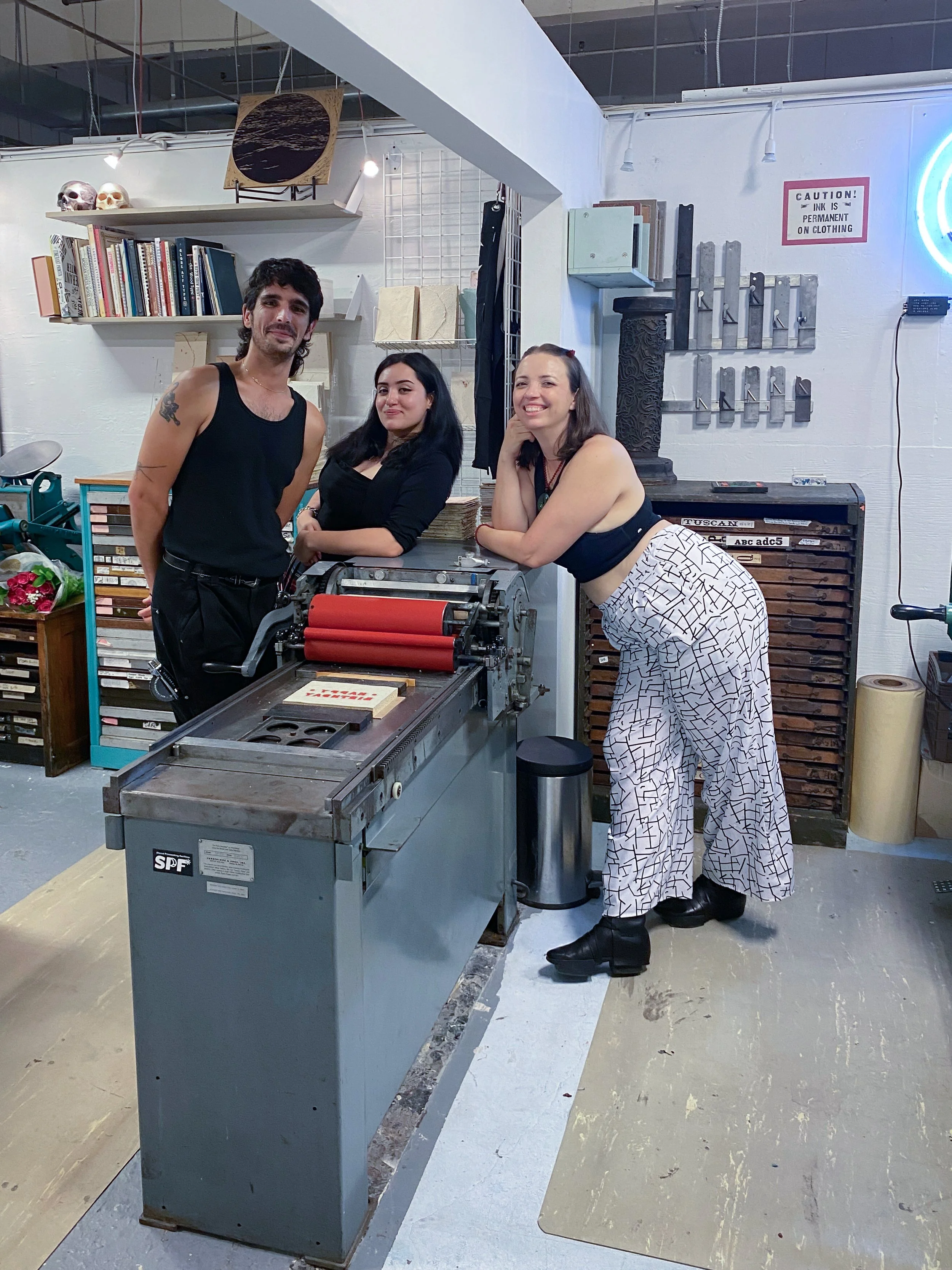
Fine art printmaking and book arts in Miami!
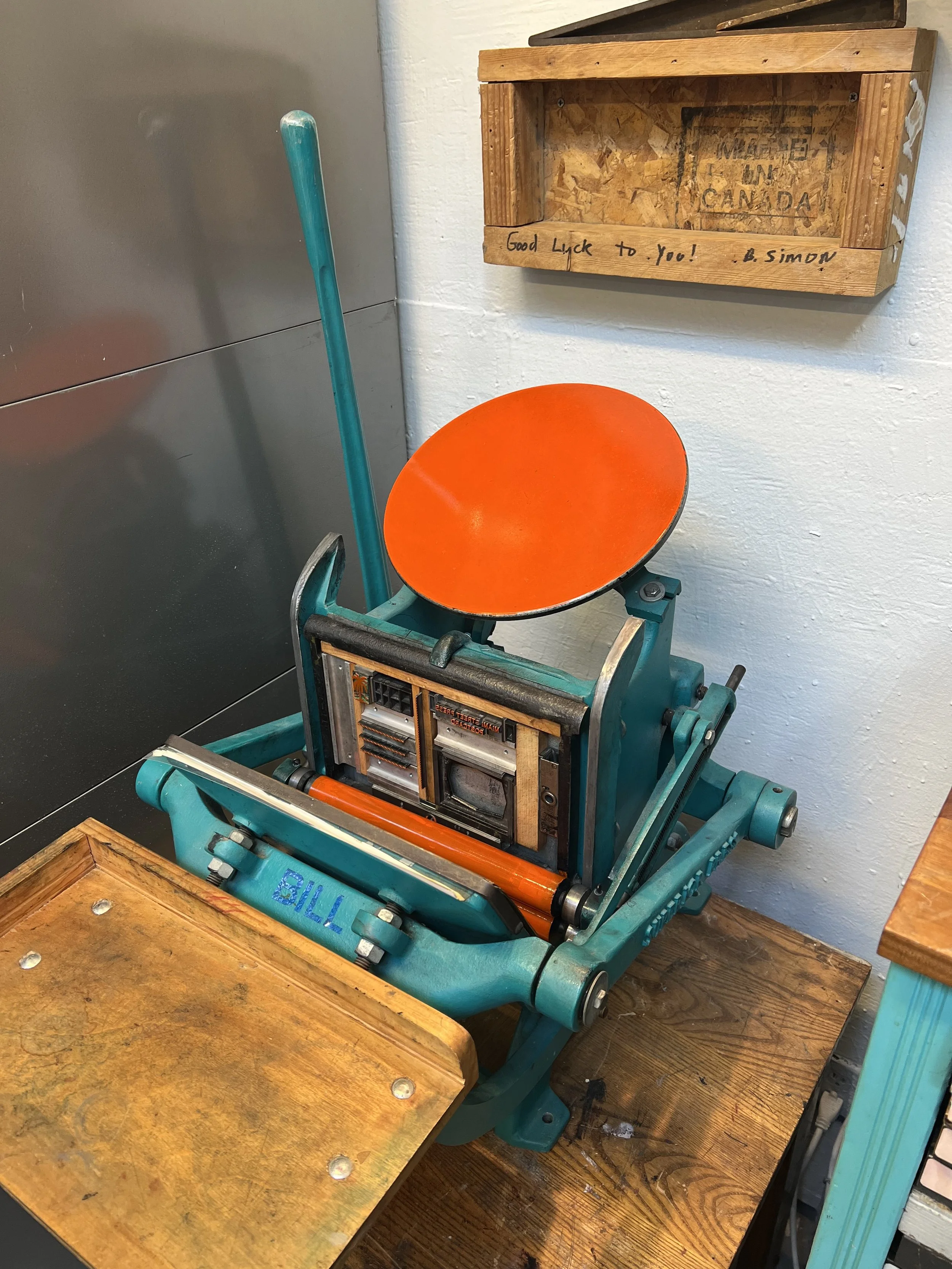
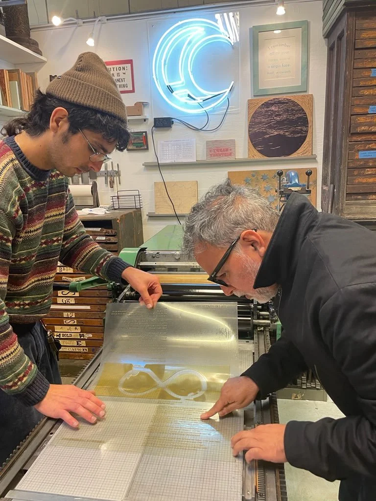
We offer hands-on access to, and training on, professional printmaking, bookbinding, and papermaking equipment. We provide studio rental, workshops, artist residencies, internship opportunities, custom bookbinding, edition printing, specialty paper and more.
Upcoming
Get Involved
-
Temporarily closed! We’ll be updating this once we’re settled in our new home!
-
Workshops are currently paused but will resume once we’re set up in our new home.
We’ll have workshops for any level of experience, from intro level classes in basic book and print techniques to master classes intended to sharpen the skills of more experienced makers. -
Artists working in a number of printmaking, book making, and papermaking processes can rent our facilities with or without assistance
-
Arrange a time to learn something new! Scheduling is flexible. Get 1-on-1 training or plan a private class with friends
-
We offer four different types of residencies which allow artists to make the most of our facilities and community. Rolling deadlines.
-
Get paid to learn and see behind the scenes in our competitive internship program. Quarterly applications.
Techniques we offer
-
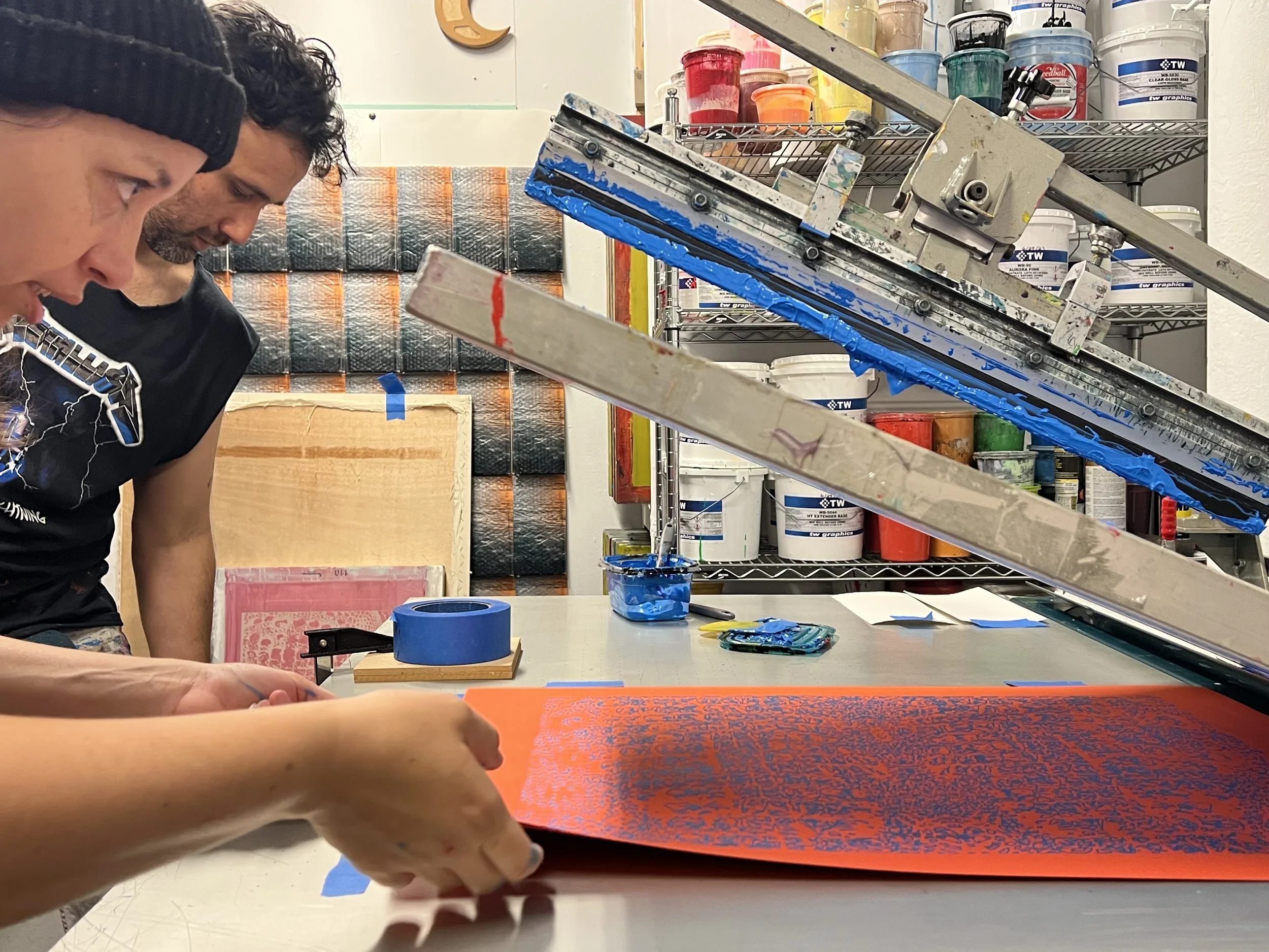
Get vibrant color, a handmade feel, and the unique feel of ink on paper with screenprinting!
-
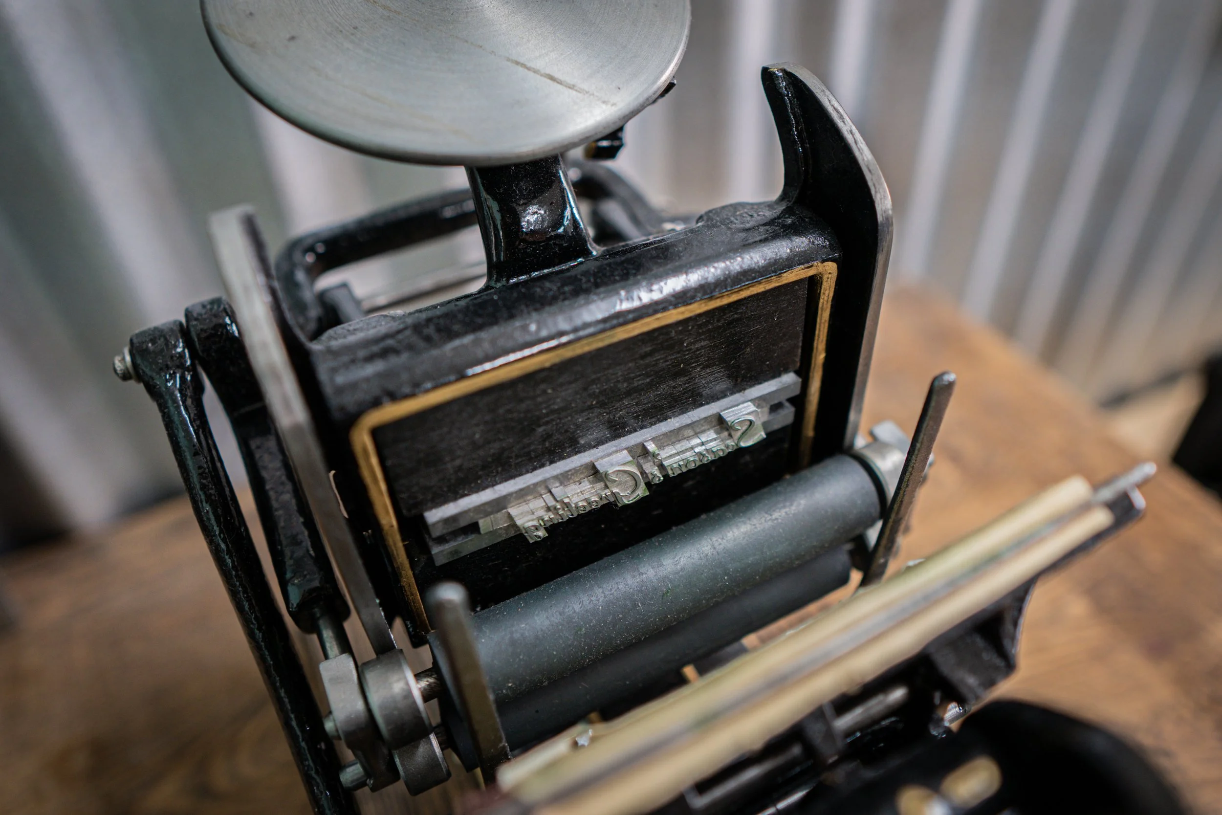
The main form of commercial printing from the 1400s to the 1970s, this technique involves pressing letters (and images) into paper and leaving a delicious impression.
-
Print carved blocks on our large etching presses (max size: 40”x80”) or take advantage of our soft tables to hand print fabric!
-
Print from your own intaglio plates or create a new copper plate using our etching and aquatinting facilities.
-
There are many ways to create unique prints in our studio! We have a selection of plexiglass plates available for monoprinting, plenty of book board in stock for making collagraph plates, and plenty of other possibilities with our trained staff!
-
We work with artists looking to make original artworks in the form of a printed edition. Our master printer has a knack for bringing even the most complicated ideas to life.
-
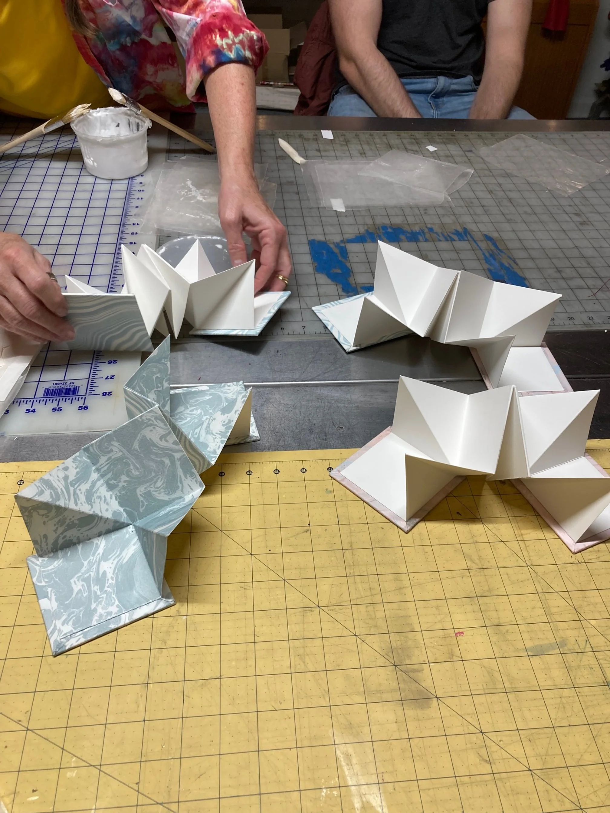
Hand crafted unique and limited edition books can be the perfect vessel for your art. Need a custom box? We can do that too!
-
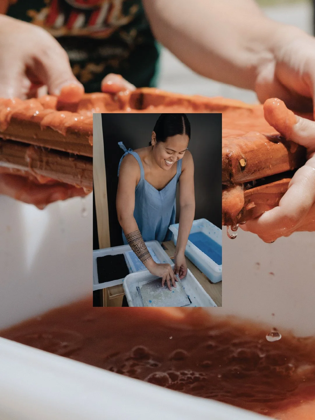
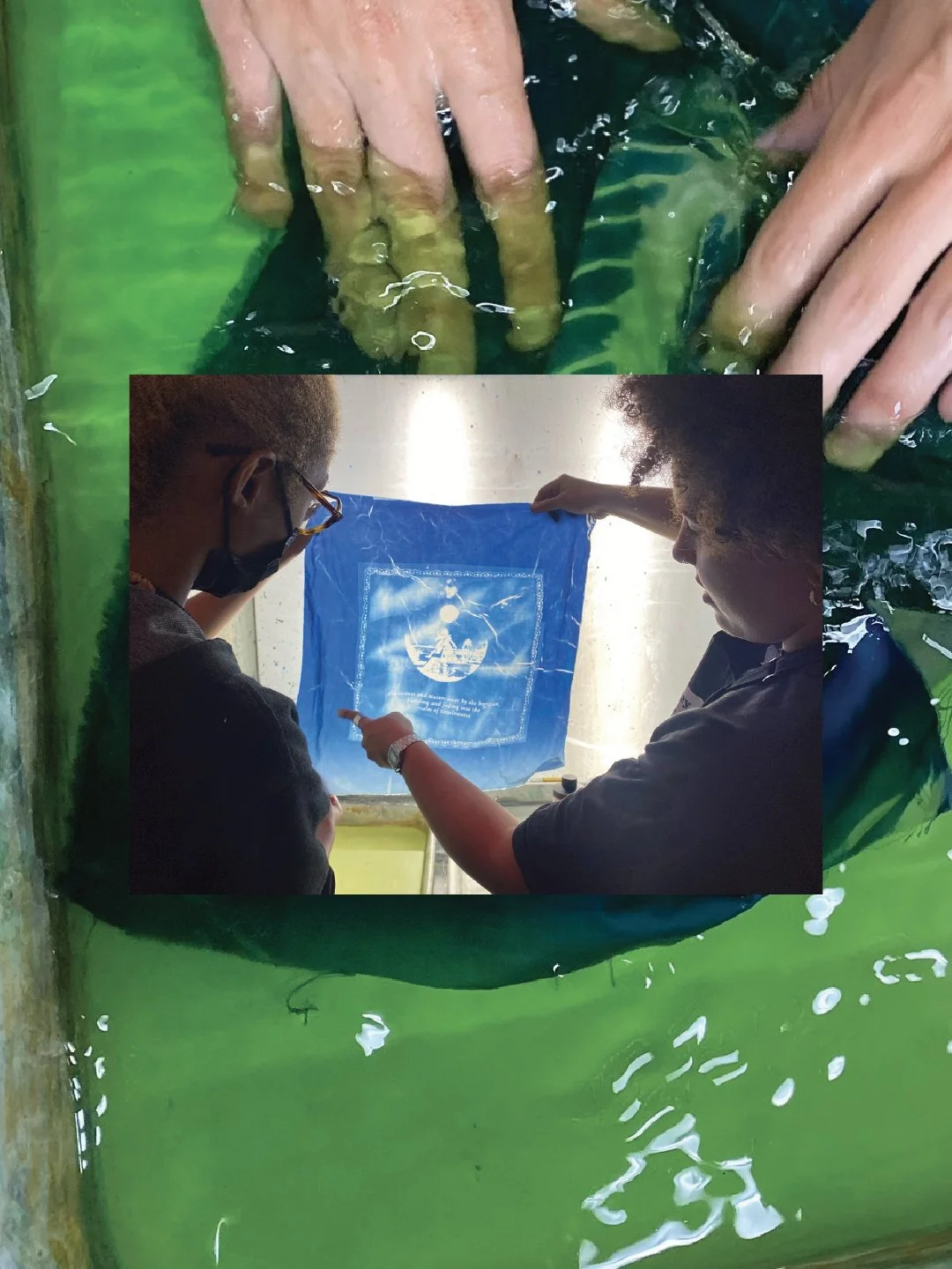
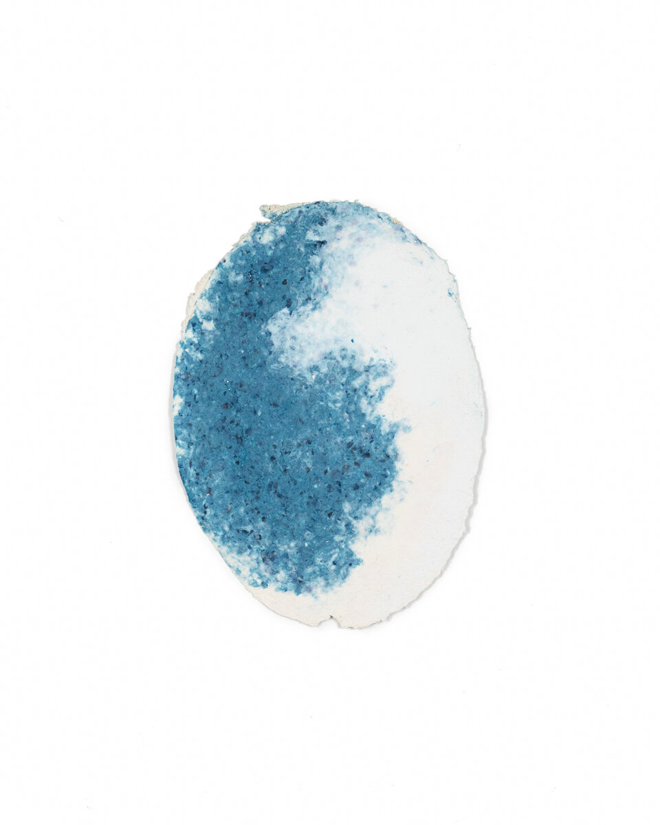
We’re currently in the process of setting up studio access to our papermaking equipment.
-
As a studio full of creatives, we love coming up with the perfect design! We can help with anything from poster design to book layout, design binding to business cards, gala invites to packaging.
Shop handmade
Nearing is the fourth installment of our Existent Books publishing program and was screenprinted by hand during April 2017. The pop ups and fold outs were cut using a Cricut home plotter. The spiral binding allows the book to stand up like a miniature stage allowing the reader to interact with the piece as a performative object as well as a book. The book consists of 18 pages with pop ups, cut outs, and fold outs. Nearing was printed in an edition of 100 books all signed and numbered by the artist.
The Unmade Room was produced at IS Projects during the Summer of 2019 and released at the London Art Book Fair at the White Chapel Gallery in London, England on Thursday September 5th. This uses several layers of screenprinting to build up a multitude of harmonious colors. The book is accordion bound with a letterpress printed cover and is contained within a vertical slip case that is hand painted by the artist. All screenprinting was done by hand in the studio by Ingrid Schindall, all letterpress printing was done on the Vandercook SP15, and all cut outs were cut by hand by Christian. The book unfolds to 80” long and can be opened and turned like a book or displayed open as a sculptural object. The book was printed in an edition of 60 and is hand numbered and signed by the artist.
To find out more about The Unmade Room click here!
Read more about Christian’s book and residency experience in this lovely interview by Michael Mackie: Painter Christian Feneck Just Created the Coolest Coffee Table Book Ever Made
TEXTual is the sixth installment of the Existent Books publishing program and was produced at IS Projects during the Spring of 2018 and released at the opening of Text(ured), Elysa's gallery show at IS Projects on May 26th, 2018. This book combines screenprinting, digital printing, and letterpress printing with a die-cut voer. All screenprinting was done by hand in the studio by Ingrid Schindall and all letterpress printing and die-cutting was done on the Vandercook SP15. The book consists of seven spreads each containing a haiku. It is drum-leaf bound with a hand folded dust jacket. The book was printed in an edition of 100 and is hand numbered and signed by the artist.
Antillean Lacunae was produced at IS Projects during the Summer of 2020 and will be released October 14th, 2020. The book is stab bound with a hard cover with linen and vintage book cloth and foil printing. The interior pages were letterpress printed, screen printed, digitally printed and laser cut. The first image of the book uses a watercolor screen monoprinting technique so each images is unique. The letterpress text was hand set by the artist from our collection of antique lead type. The book was printed in an edition of 100 and is hand numbered and signed by the artist.
Convergence was produced at IS Projects during the Summer of 2020 and was released October 14th, 2020 during E/AB Fair. The book is drum leaf bound with a curved hard cover and shaped pages. The cover is foil printed and the interior pages are letterpress and screen printed using algae pigmented plant based ink. The centerfold and last image page include lasercutting and screen printing. Each book is signed and numbered by the artist. A special edition of the first 20 books in the edition of 100 come with a special 3D printed slip case designed by the artist.
To find out more about Convergence click here!
Read more about Michelle’s book in this lovely blog post written by the artist: September: Syzygy
unknowing was produced at IS Projects during the Summer of 2021 and will be released October 18th, 2021 during E/AB Fair and Vancouver Art Book Fair. The book is drum leaf bound with a custom double-hinged slip case holding a letterpress and lasercut vovelle and a limited edition etching printed by Kim Spivey at Ground Printmaking. The book contains letterpress printed text with toner printed imagery and hand marbled end pages on Strathmore 400 Series Black paper. The cover is silver foil stamped silk mohair book cloth. Each book is signed and numbered by the artist. There are 7 different etching variations that are paired at random with each book. A special edition of 3 super collector’s books containing all 7 of the etching variations are also available
Please note: Books are currently in production and will ship at the end of October 2021
Devoted was letterpress printed on our Vandercook SP15 from hand burned pressure plates, prepared by Beth, and handset 24 point Spire lead type. The book is printed on Colorplan 70# grey paper and a 130# Colorplan grey cover. We used the drum leaf binding technique so the book opens completely flat with no disruption of the image. It is a limited edition of 100 copies all hand signed and numbered by the artist.
Tidal is a book of poems that compare the ebb and flow of thought to the ebb and flow of the tides written between the Summer of 2014 and the Fall of 2016. The paper was made by the artist while she was the Helen M Salzberg Artist in Residence at the Jaffe Center for Book Arts in Boca Raton, FL. The marbled, cotton sheets were made at the beach in Boca Raton, Florida using the saltwater from the ocean to float the paper pulp leaving sand, seaweed, and the smell of the salty air intermingled in its fibers. The text was letterpress printed by the artist at IS Projects on a Vandercook SP15. Tidal was printed and bound in an edition of 10 in February 2017.
Material: Letterpress Printing and Suminagashi Marbling on handmade cotton and abaca paper with double raised cord binding in clamshell box.
Size: 6.5 x 6.5 x 1.5”
Reliquary
Beth Sheehan
2017
Screen printed tunnel book
6 inches x 5 inches x approx. 9.5 inches
Edition of 40
Printed and published by the artist
Persian Alphabet Letters
Gonar Adili
Wool felt, wood, duo book cloth and paper box with a plastic lid and a magnetized back for hanging on a wall. On the back of each letter there is a Persian alphabet map with the particular letter highlighted for identification.
3-1/2 x 5-1/2 x 1“
When checking-out, you can select which letter you would like A-Z and which felt color your would like (orange, blue, green or eggplant/brown)
Fort Lauderdale 1
Ingrid Schindall
2019
20x16” Handmade Paper
(Slide 1: Front of piece & Slide 2: Back of piece)
$1,500
Fort Lauderdale 2
Ingrid Schindall
2019
20x16” Handmade Paper
(Slide 1: Front of piece & Slide 2: Back of piece)
Fort Lauderdale 3
Ingrid Schindall
2019
20x16” Handmade Paper
(Slide 1: Front of piece & Slide 2: Back of piece)
Dry Tortugas 1
Ingrid Schindall
2019
20x16” Handmade Paper
(Slide 1: Front of piece & Slide 2: Back of piece)
Dry Tortugas 2
Ingrid Schindall
2019
20x16” Handmade Paper
(Slide 1: Front of piece & Slide 2: Back of piece)
See the Sea, 2017
Ingrid Schindall
20x24”
Linocut on cotton rag paper
Edition of 10
Surface II, 2020
Ingrid Schindall
Linocut on Somerset Satin
18x25” Paper Size, 12x18” Image Size
Edition of 20
Betwixt
Ingrid Schindall
Linocut on Somerset Satin
28x29” Paper Size
2019
Edition of 10
Southern Boyhood
Kyle Holland
2018
Screenprint on handmade abaca paper.
20" W x 16" H.
Edition of 10.
Printed and published by the artist.
Ostracized
Kyle Holland
2017
Etching, aquatint, and surface roll with chine collé.
18" W x 25" H.
Edition of 4.
Printed and published by the artist.
by Ingrid Schindall
It is what you make of it. is an artist book in the form of a set of 7 postcards. The title implies the theme of the writing throughout the book, that life is what you make of it, as well as the physicality of the book, that how the viewer chooses to make use of the book determines it's function (keep the set together, send them out to friends, or frame them, etc.) The photographs were taken by the artist over the last 5 years in different places around the world. The sentences were hand set in lead type and paired with a vintage mathematical diagram block and letterpress printed onto the photograph.
Dimensions:
5" x 7"
7 cards that come in a signed and editioned envelope.
Limited edition of 100 printed and assembled by the artist.
by Ingrid Schindall
"wading waiting" is an artist book in the form of a postcard set. It consists of seven couplets that can be read starting with either segment. The photographs paired with the couplets were taken with the camera facing straight up or straight down to remove the perspective.
"wading waiting" consists of letterpress printed type on top of digitally printed photographs. It was printed in an edition of 180 and each set is signed and editioned by the artist.
We made it 7 years!!
Celebrate and support the studio by adding this killer poster to your collection!
Printed with type from the Jon Selikoff Collection here at IS Projects, this poster uses a Dayglo gradient to achieve sunset in paradise vibes.
Poster size: 18x24.5” printed on French Speckletone
5% of all proceeds from this projects will go to the Greater New York Chapter of the ALS Association in Jon’s memory to raise awareness and fund research for a cure!
Printed in September, 2021
This is the eleventh edition of our monthly type specimen poster project!
“Stepping out in Summer”
This poster features Antique Double Outline Half Ray and Half Solid Shade AKA Antique Ornamented, a popular face in the 1800s. Antique ornamented was first presented by William H Page in the 1849 catalogue. The bold design creates a sense that the letters are leaping out at you from the page so we designed a poster that celebrates the optimistic coming out that the summer of 2020 felt like. The specimen takes the form of a word search with sunny summer fun words that can be found throughout the poster.
Each poster in this series consists of a pangram, a sentence that contains all the letters in the alphabet, showing off a different typeface from the Jon Selikoff Collection here at IS Projects.
5% of all proceeds from this projects will go to the Greater New York Chapter of the ALS Association in Jon’s memory to raise awareness and fund research for a cure!
Printed in June 2021
This is the tenth edition of our monthly type specimen poster project!
“Field of Feelings”
This poster features Aldine, a nearly ubiquitous font in it’s day that is still beloved today. There are several digital revivals of different weights and variations of this classic early wood type font. This font was patented by William H. Page on March 15th 1870 so we decided to make a poster to celebrate its sesquicentennial! We’ve been going through such a rollercoaster of emotions with the current state of events so we wanted this poster to be relevant to the time it was created while also creating a bit of positivity and reprieve from the seriousness that we face each day.
Each poster in this series consists of a pangram, a sentence that contains all the letters in the alphabet, showing off a different typeface from the Jon Selikoff Collection here at IS Projects.
5% of all proceeds from this projects will go to the Greater New York Chapter of the ALS Association in Jon’s memory to raise awareness and fund research for a cure!
Printed in March - May 2020
This is the ninth edition of our monthly type specimen poster project!
“Take Me Out to the Ball Game”
Perhaps one of the most fortuitous posters in the collection, this design features Columbus, a typeface designed by Herman Ihlenburg in 1892. The typeface was originally designed for lead type but was quickly translated for wood as well. This typface was used as the basis for the original Cracker Jack logo so we made the poster using the lyrics from one of the most iconic Americana songs in history that also happens to mention this classic snack. We used linoleum cuts from the Selikoff collection of baseball players to add some action and showcase other aspects of the collection.
Each poster in this series consists of a pangram, a sentence that contains all the letters in the alphabet, showing off a different typeface from the Jon Selikoff Collection here at IS Projects.
5% of all proceeds from this projects will go to the Greater New York Chapter of the ALS Association in Jon’s memory to raise awareness and fund research for a cure!
Printed in June 2019
This is the eighth edition of our monthly type specimen poster project!
"A Portrait of William H Page"
This long awaited (my apologies) poster features both the front and the back of this beautiful and funky typeface from the 1800's. In researching this face I came to know a lot about the man who founded the company that created it, Mr. William H. Page. He was way ahead of his time and a man of many talents and a dynamic entrepreneur. After making his mark, a huge one at that, in the flash-in-the-pan industry of manufacturing wood type he moved right into another invention heavy, up and coming market, steam heaters. This poster is an ode to the maverick and gregarious man behind the type.
Each poster in this series consists of a pangram, a sentence that contains all the letters in the alphabet, showing off a different typeface from the Jon Selikoff Collection here at IS Projects.
5% of all proceeds from this projects will go to the Greater New York Chapter of the ALS Association in Jon’s memory to raise awareness and fund research for a cure!
Printed in February 2019
This is the seventh edition of our monthly type specimen poster project!
This poster features a couple different widths of Latin which has a long history originating in England then making it over to the US in 1879! IS Projects celebrated it's 4 year anniversary and this poster reflects that celebration with a perky pangram and a screenprinted adaptation of marbled paper.
Each poster in this series consists of a pangram, a sentence that contains all the letters in the alphabet, showing off a different typeface from the Jon Selikoff Collection here at IS Projects.
5% of all proceeds from this projects will go to the Greater New York Chapter of the ALS Association in Jon’s memory to raise awareness and fund research for a cure!
Printed in September 2018
This is the sixth edition of our monthly type specimen poster project!
Clarendon is a common metal and digital font. It was designed by Robert Besley for The Fann Street Foundry, also known as Thurowgood and Besley, in 1845 in England. The original metal letters were cut by Benjamin Fox. This was one of the first fonts to be registered and was named for the Clarendon Press at Oxford University.
The wood font has nebulous origins, Rob Roy Kelly claims that it evolved from Antique and Ionic fonts with the key difference of having bracketed serifs. The first showing of the font is credited to L. Johnson & Company in 1847 but the first specimen is found in the 1853 catalog by Bill, Stark, & Company.
Clarendon has remained a popular font throughout its history and saw a massive surge of popularity in the 1970's gracing numerous record covers and show posters. You might recognize it from the Sony logo, older National Parks informational signs, and the Wells Fargo Logo.
This poster is the shortest pangram in the series to date that I have written myself. You'll notice, if you look closely, that there is a letter missing. Unfortunately, this drawer of type was missing that letter and all of it's punctuation. You never know what you are going to get when uncovering a collection of this magnitude and sadly not all of the typefaces in the collection are complete. However, I thought that the size and excellent condition of this type, as well as it's historical significance, warranted a place in the poster series.
Each poster in this series will consist of a pangram, a sentence that contains all the letters in the alphabet, showing off a different typeface from the Jon Selikoff Collection here at IS Projects.
5% of all proceeds from this projects will go to the Greater New York Chapter of the ALS Association in Jon’s memory to raise awareness and fund research for a cure!
Printed in August 2018


Design by Edau
Disarray was letterpress printed on our Vandercook SP15 from photopolymer plates onto Colorplan Cobalt 130# cover, Springhill Grey 110# cover and Cougar Opaque White 130# cover then spiral bound in our very first spiral binding adventure. It is a limited edition of 100 copies all hand numbered by the artist.
More info about the project here >