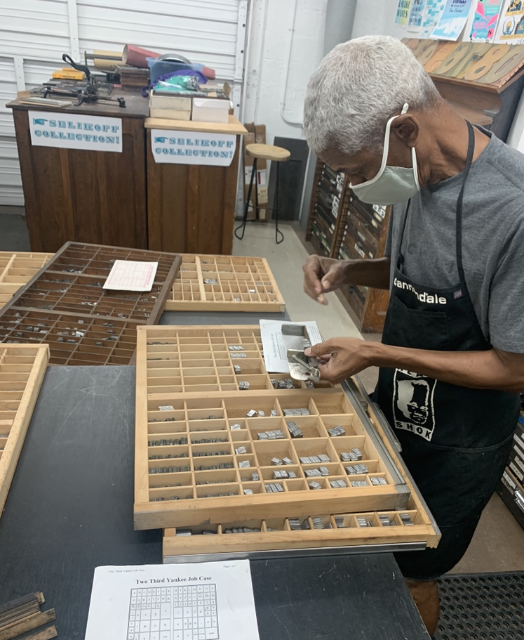
Existent Books is a semi-annual publishing initiative which brings artists to IS Projects to experience fine art printmaking and letterpress printing. These artists then design an artist-book that is inspired by our collection of historical letterpress type and image cuts or new printmaking techniques learned at IS Projects. The goal of Existent Books is to encourage contemporary artists to contribute to the ongoing history of book arts while stimulating the evolution of the medium.
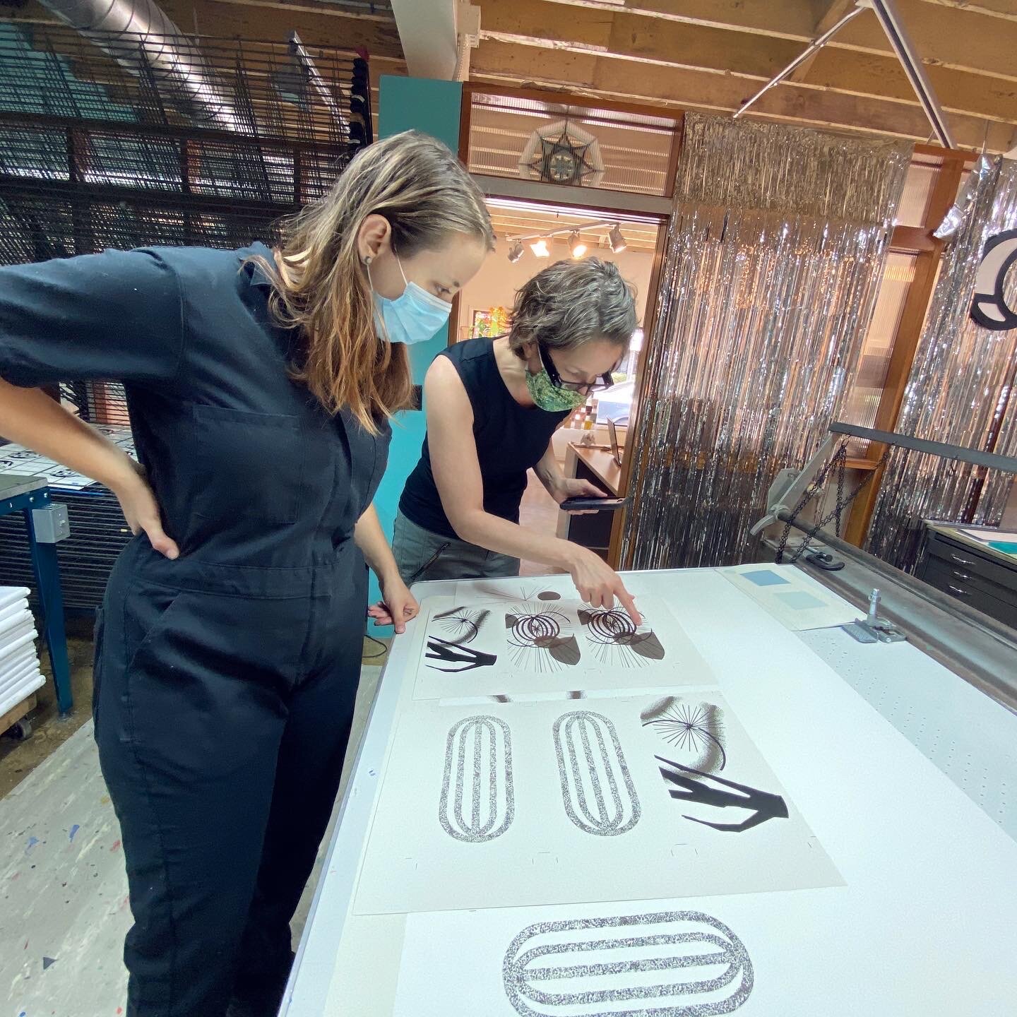
With support from The John S. and James L. Knight Foundation, we are pleased to announce our 2021 Existent Books Artist Residency Recipients
Carol Prusa is a mid-career contemporary artist known for her meticulous silverpoint technique and use of unexpected materials from sculpted resin and fiberglass to metal leaf and LED lights. Born in Chicago, Prusa lives and works in South Florida and exhibits internationally, including at Brintz Gallery/375 Gallery (Palm Beach) and Bluerider Art (Taipei). Her work is included in excellent public and private collections.
Elia Khalaf is a psychotherapist and community-oriented artist supporting LGBTQIA youth, BIPOC, homeless adults, and cancer patients. He positions his work at the intersection between art, community wellbeing, and mental health while exploring creativity for healing individually and collectively.
Previous Existent Books
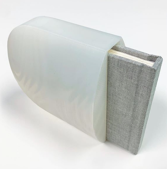
Summer 2020: Michelle A. M. Miller Convergence
Michelle A M Miller is a multidisciplinary artist living and working in West Palm Beach, FL exploring a language of visual abstraction where perception and imagination coalesce with mindful art production. Through personal biography, science, history, myth, and fiction she examines what she perceives are the essential forms and radiant energies of our cosmic, entangled existence. Recent solo exhibitions include Resource Depot, West Palm Beach and IS Projects, Ft Lauderdale. She has been awarded artist residencies at Atlantic Center for the Arts, New Smyrna Beach and IS Projects, Ft Lauderdale. Miller earned her BFA in painting from Florida Atlantic University and her BA in art history from Georgetown University.
From Michelle:
“Convergence is a durable recording of a fading memory I want to fix in time and the reverie it inspired. It is equal parts family biography, scientific exposition, and abstract imagery contained within a touchable sculptural object. The accompanying score by Tessa Brinckman adds an aural velatura and conjures a cosmic waterscape highlighted by a recording of my mother speaking Miskitu. As Convergence carries us from the terrestrial to the celestial, we experience memory, time, place and the convergence of seemingly asynchronous events and ideas.”
Covergence is available in our shop >>
Read more about Michelle’s book in this lovely blog post written by the artist: September: Syzygy
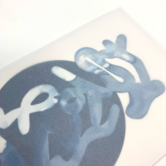
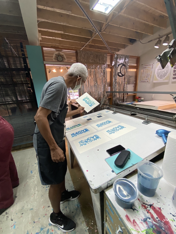
Summer 2020: Onajide Shabaka Antillean Lacunae: points of departure
Onajide Shabaka, is an interdisciplinary cultural practitioner, and currently lives and works in Miami, Florida. Shabaka’s practice is connected through historical and biographical themes related to ethnobotany and geography that include African diaspora and Native American cultures. Onajide Shabaka has been artist in residence at Suriname Botanical Research Residency, DVCAI, Paramaribo, Suriname; AIRIE Everglades Artist Residency, Everglades National Park, FL; Project Row Houses, Visiting Artist, Houston, TX; DVCAI Artist Residency, San Miguel de Allende, Mexico; selected participant in international cultural exchanges in, Suriname, Guadeloupe, Jamaica, and awarded grants & fellowships including, Creative Investment Grant, Broward County, FL; New Forms Florida, Individual Artist Grant; Individual Artist Fellowship, Florida Department of Cultural Affairs; Florida Humanities Council; Locust Projects Wavemaker Grant; and ArtCenter South Florida Ellies Grant. Shabaka was awarded an MFA from Vermont College of the Fine Arts.
From Onajide:
“My book, "Antillean Lacunae: points of departure," follows my path over the past several years through several residencies and research on subsistence and industrial rice cultivation, and the culture developed around those doing the labor. The majority of my investigations have taken place in Suriname (South America) and coastal Georgia (Lowcountry). Both regions were heavily influenced by the agricultural knowledge of Africans, both those enslaved and maroons (who escaped the plantations for freedom). The book has a small amount of text, but includes photographs of specific sites, laser cut drawings, letterpress and screen printed images of drawings, with an opening page that is unique in each copy. I am pleased and excited to present this very special editioned artist book.”
Antillean Lacunae: points of departure is available in our shop >>
Summer 2019: Christian Feneck The Unmade Room
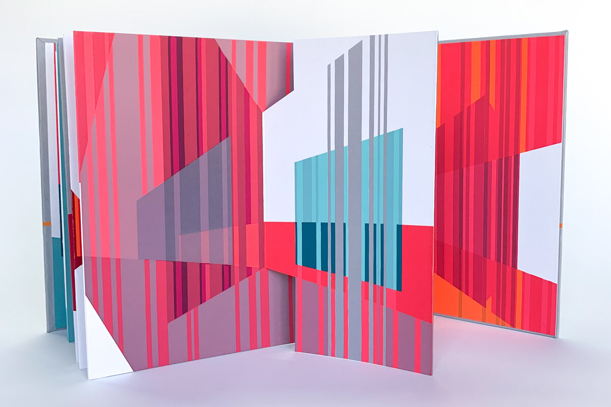
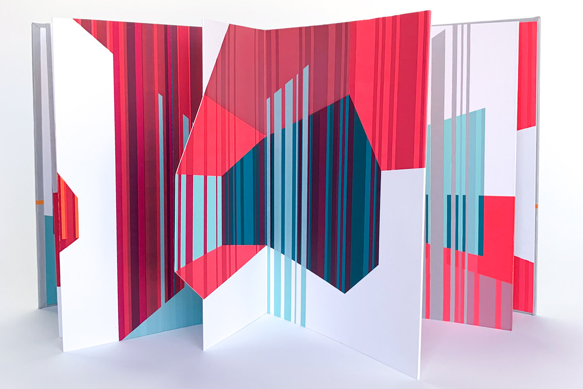
Christian Feneck’s fascination with color and space, and the way we perceive them, began early. Born in Massachusetts, Christian spent a peripatetic upbringing living primarily in Hawaii, California, and Florida continually drawing, painting, and building. These constant activities ultimately led him to study architecture in Italy and Florida where he earned a Master of Architecture degree from the University of Florida. Through these studies, he found visual perception to be the prime motivation for design and understanding of architectural space and developed a painting technique to further explore this belief. Christian’s paintings use color and basic forms in a series of opaque and translucent layers to create a variety of color interactions. The interaction of these color fields creates the perception of movement, space, and depth within each composition.
From Christian:
“My work has always focused on our visual understanding of space and color, and until this project, has been non-narrative. Creating a piece within the sequential framework of a book allowed me to explore and design in a visually narrative way.
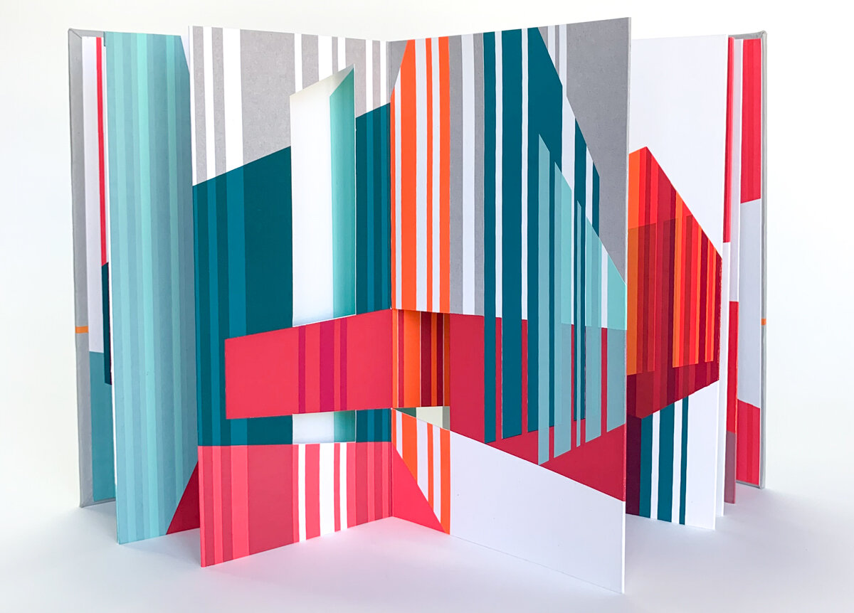
I began the design of the book with simple spaces that grew in complexity as they extended and merged with adjacent features. Instead of a single view, I was able to experiment with a consecutive series of spaces where each moment affects the next. It became a process similar to the interaction of color where perceptual understanding is contextual.
The accordion book structure also allowed me to literally fold and unfold compositions, expanding and contracting the spatial sequence. Though I did take time to craft intricate changing compositions, I did leave a few interactions to chance so even I would have a sense of discovery with the finished work.”
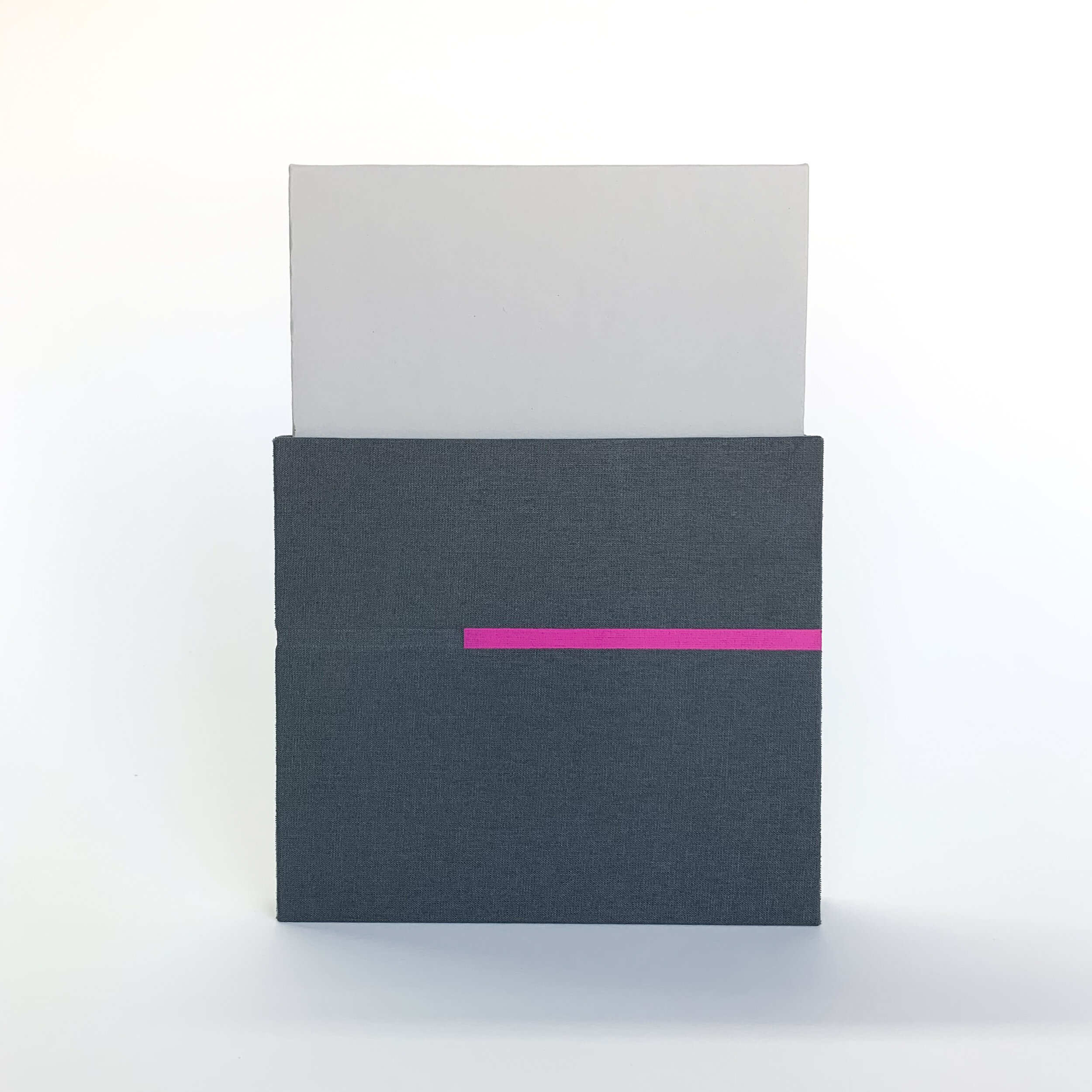
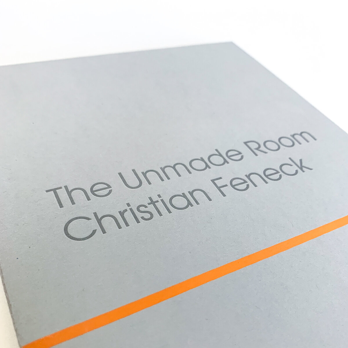
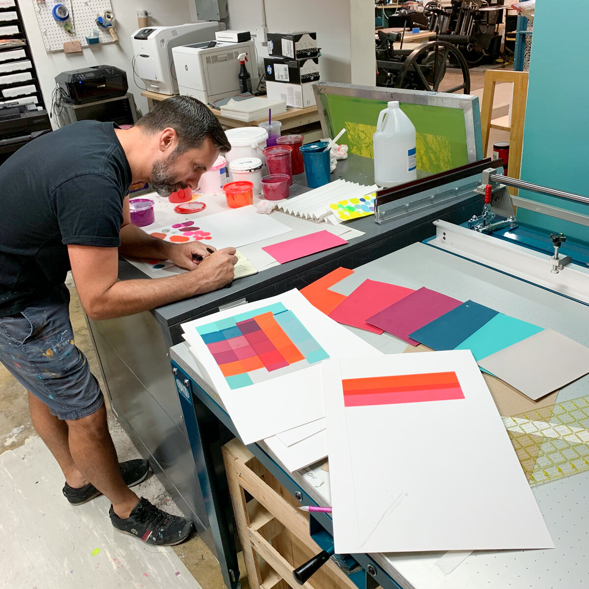
The Unmade Room was produced at IS Projects during the Summer of 2019 and released at the London Art Book Fair at the White Chapel Gallery in London, England on Thursday September 5th. This uses several layers of screenprinting to build up a multitude of harmonious colors. The book is accordion bound with a letterpress printed cover and is contained within a vertical slip case that is hand painted by the artist. All screenprinting was done by hand in the studio by Ingrid Schindall, all letterpress printing was done on the Vandercook SP15, and all cut outs were cut by hand by Christian. The book unfolds to 80” long and can be opened and turned like a book or displayed open as a sculptural object. The book was printed in an edition of 60 and is hand numbered and signed by the artist.
The Unmade Room is available in our shop >>
Read more about Christian’s book and residency experience in this lovely interview by Michael Mackie: Painter Christian Feneck Just Created the Coolest Coffee Table Book Ever Made
Spring 2018: Elysa D. Batista TEXTual
Elysa D. Batista is a mixed media artist, based in Miami, FL, who works with language, specifically the multiplicity of meaning according to different contexts. Her three-dimensional work explores personal experiences with power dynamics in race, gender, and nationality and is interpreted through the use of semiotics. Born in Panama City, Panama. Batista received her BFA in Graphic Design from the University of Miami (2009) and her MFA from Parsons the New School of Design (2013).
From Elysa:
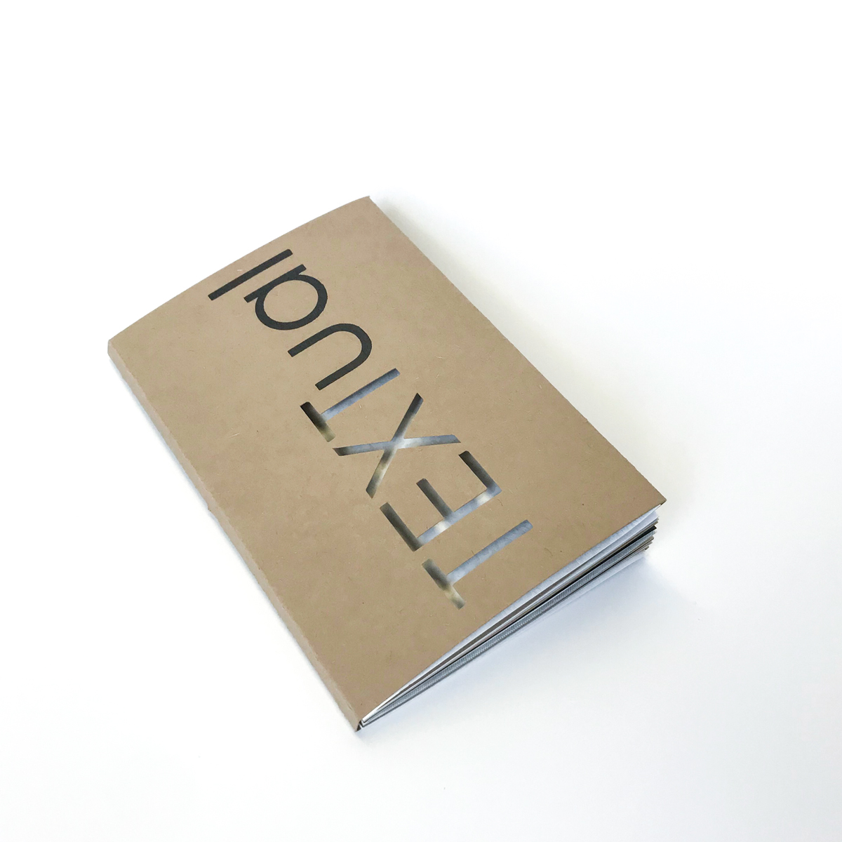
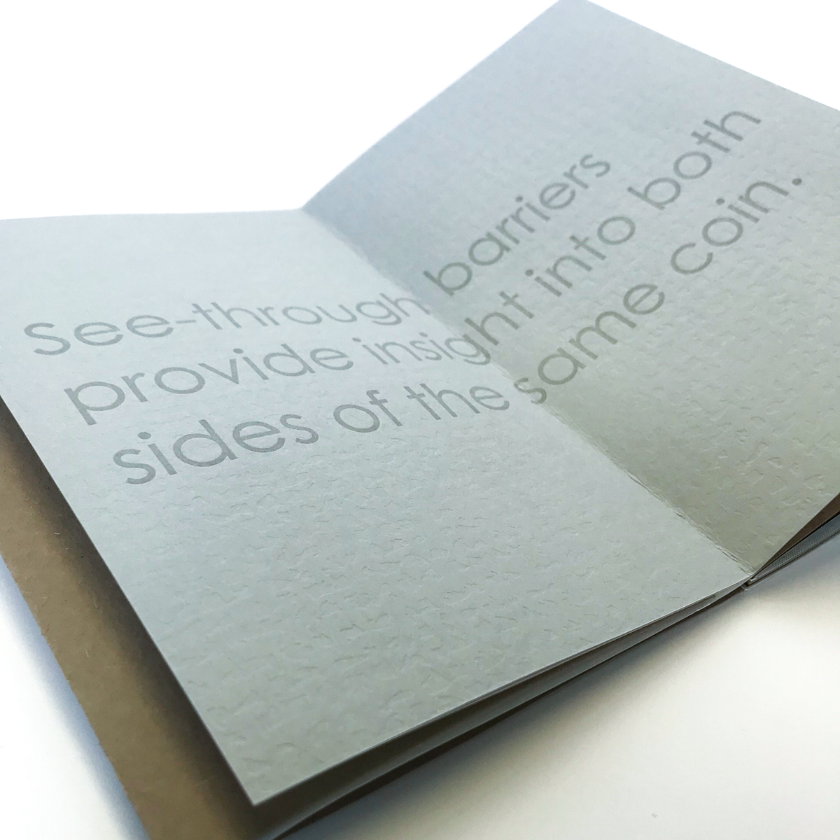
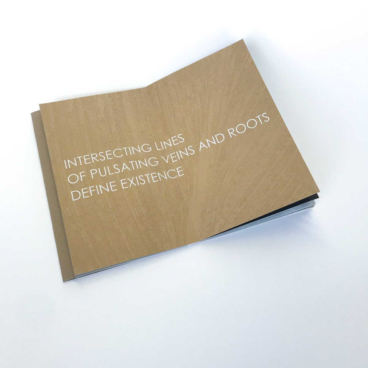
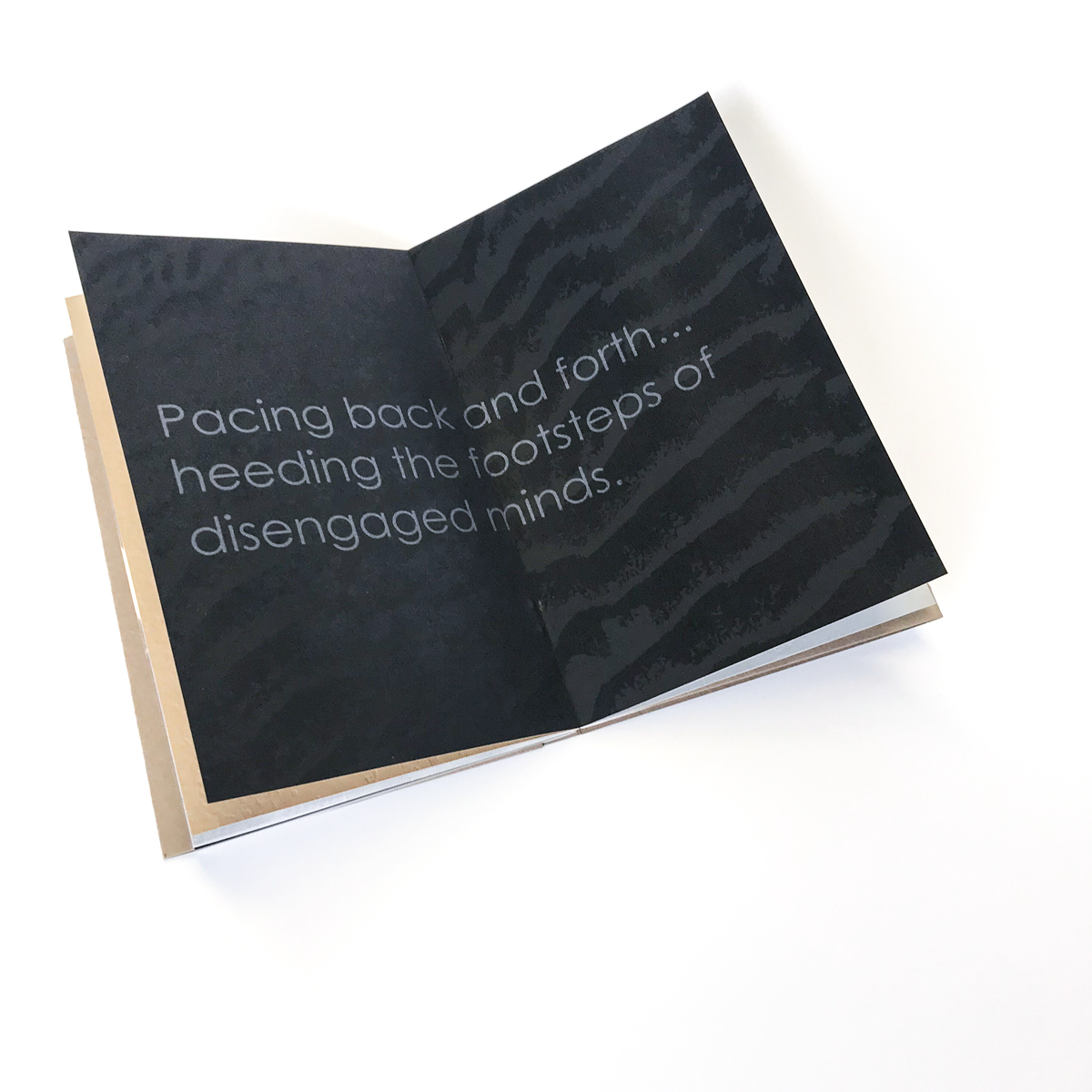
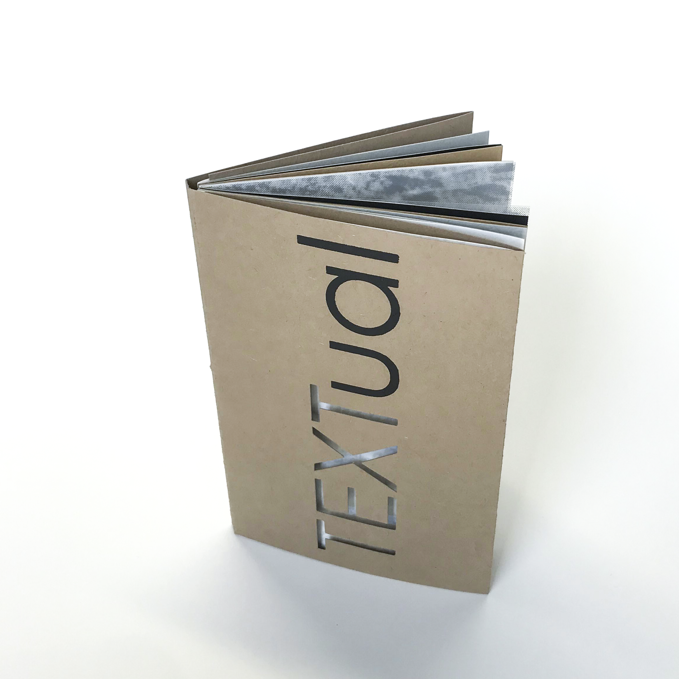
"TEXTual was created in tandem with the artist residency at IS Projects and the resulting Texture(d) exhibit. The notion of touching with ones eyes and seeing information through ones fingers are ongoing explorations in my own artwork and the inspiration for this book. As a sculptor who dabbles in concrete poetry, it was a vision to see the larger haikus I have made as three-dimensional pieces reborn as visually tactile prints that could be intimately held in ones hand. As one would use a personal notebook of ideas or diary to store unspoken information, the book contains some of my secrets, thoughts, and life experiences. The viewer's desire to engage with the book through physical connection is purposefully increased, and in fact encouraged, through an array of printed ink treatments and debossment. Reversing the childhood notion of "don't touch that", in fact please do, TEXTual allows the viewer to discover how my intangible thoughts feel when materialized."
TEXTual was produced at IS Projects during the Spring of 2018 and released at the opening of Text(ured), Elysa's gallery show at IS Projects on May 26th, 2018. This book combines screenprinting, digital printing, and letterpress printing with a die-cut voer. All screenprinting was done by hand in the studio by Ingrid Schindall and all letterpress printing and die-cutting was done on the Vandercook SP15. The book consists of seven spreads each containing a haiku. It is drum-leaf bound with a hand folded dust jacket. The book was printed in an edition of 100 and is hand numbered and signed by the artist.
Fall 2017: Brian Butler The Wonders of Mini Golf
Brian Butler is a confident illustrator and muralist with a strong background in branding and design. His approach to research has defined his style, where he regurgitates topics through a personal filter that merges observation with archetype and imagination.
He has honed his observational talent with nearly a decade of Show Drawn concert drawing. A practice whereby he illustrates his surroundings in a sketchbook throughout the duration of a concert.
His interests also include ice cream and cryptozoology, which fuel an ongoing quest to elevate the mysterious ice cream human hybrid to the same legendary status as Bigfoot.
From Brian:
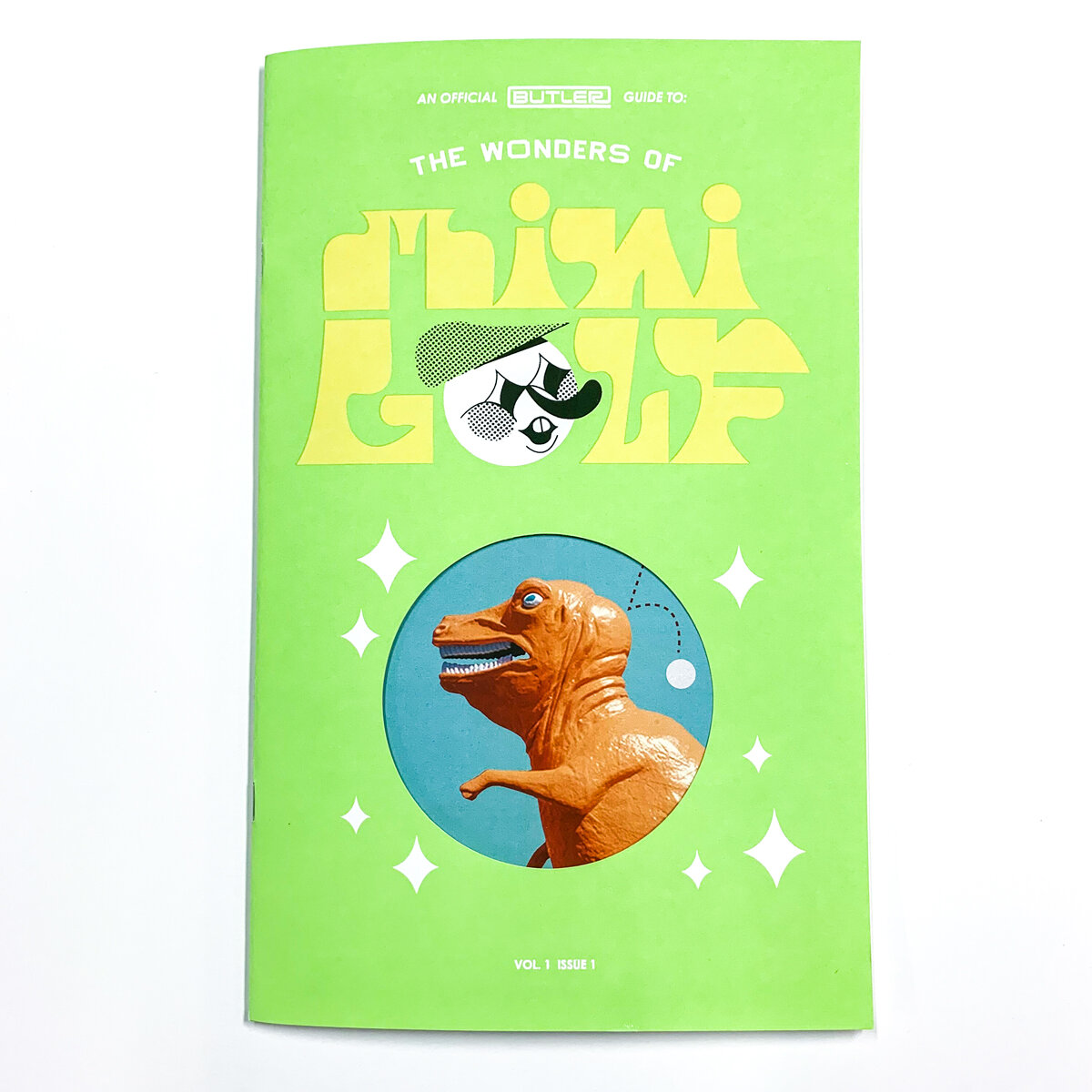
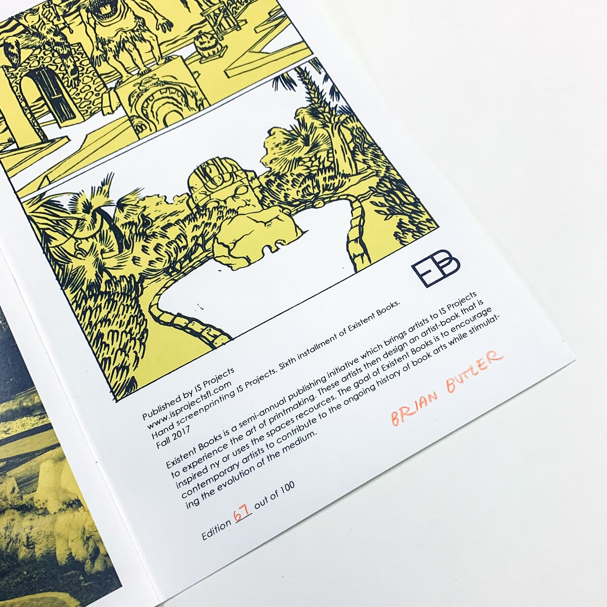
"I majored in miniature golf in college, and for my thesis I played every course in Massachusetts, of which there where eighty four active courses and a handful of abandoned ghost courses. My interest was spurred by reports of a landmark orange dinosaur obstacle being toppled in an act of vandalism. I was struck by the vulnerable state of the game, and wanted to document as many courses as possible.
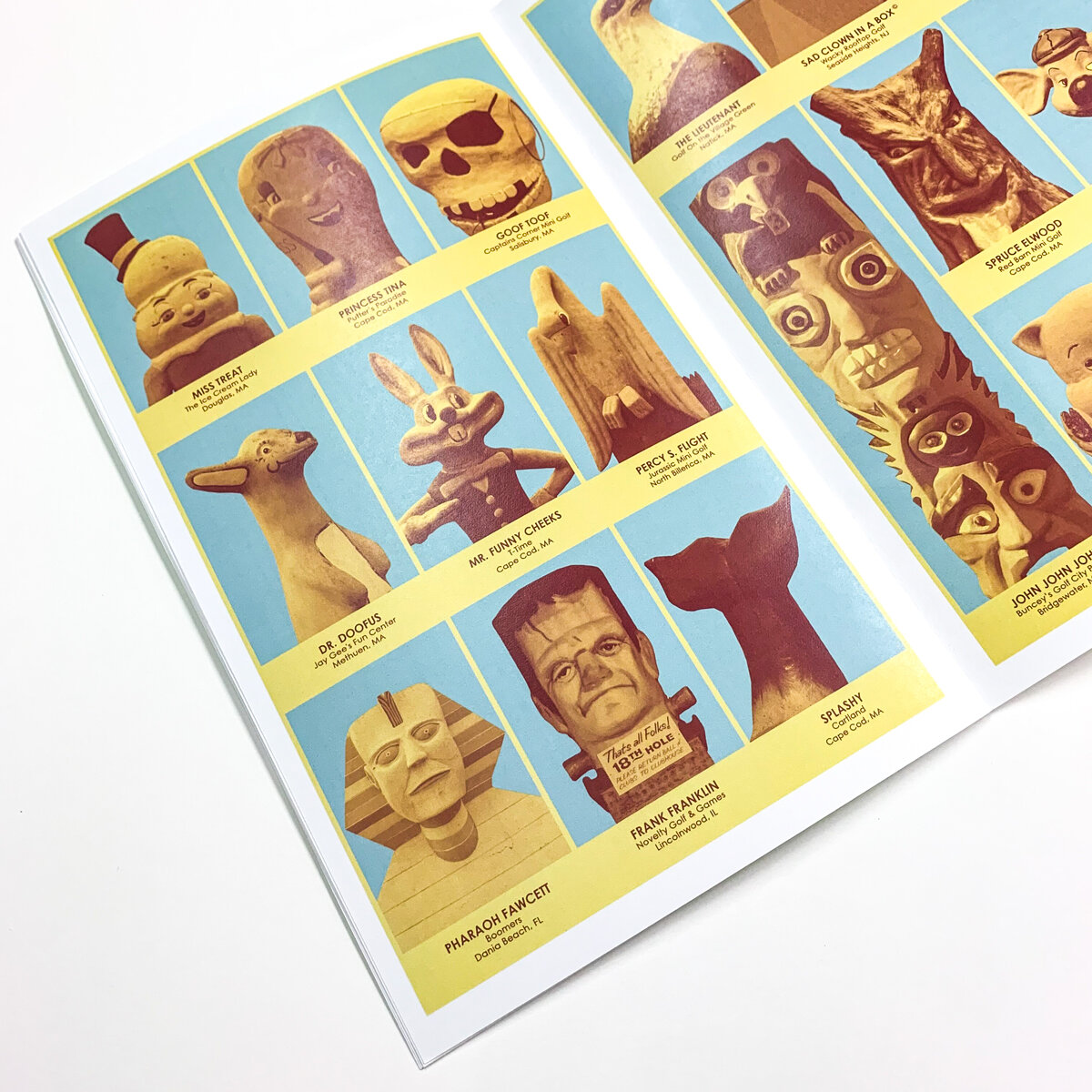
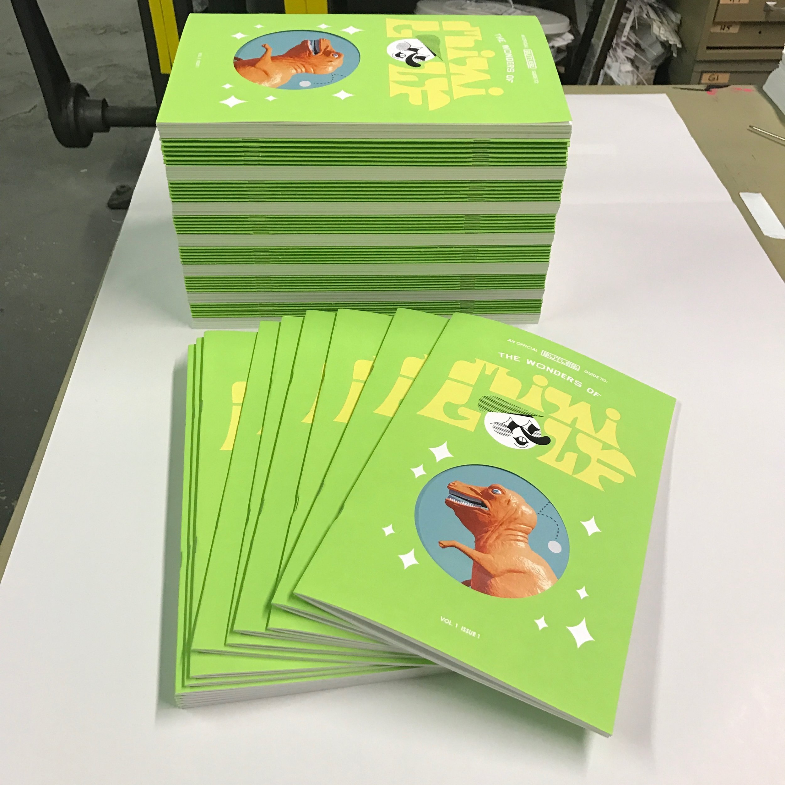
I've subsequently crafted a handful of holes and paintings on the topic, but this project was an opportunity for me to highlight my favorite visual aspects of the game. I love the utility and design choices of score cards and golf pencils. I romanticize the utopia in which you can find a church, alien, and dinosaur obstacle coexisting with shared purpose. I imagine how a kitschy bright orange Sphinx replica will capture the imagination of a kid, and how it's existence as an advertising tool is reaffirmed when that kid's parents are dragged into a round of golf. "
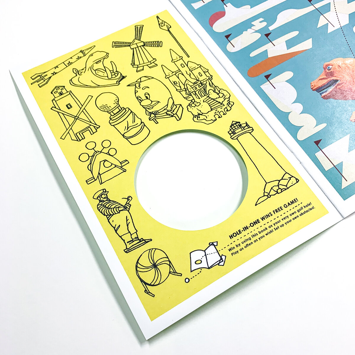
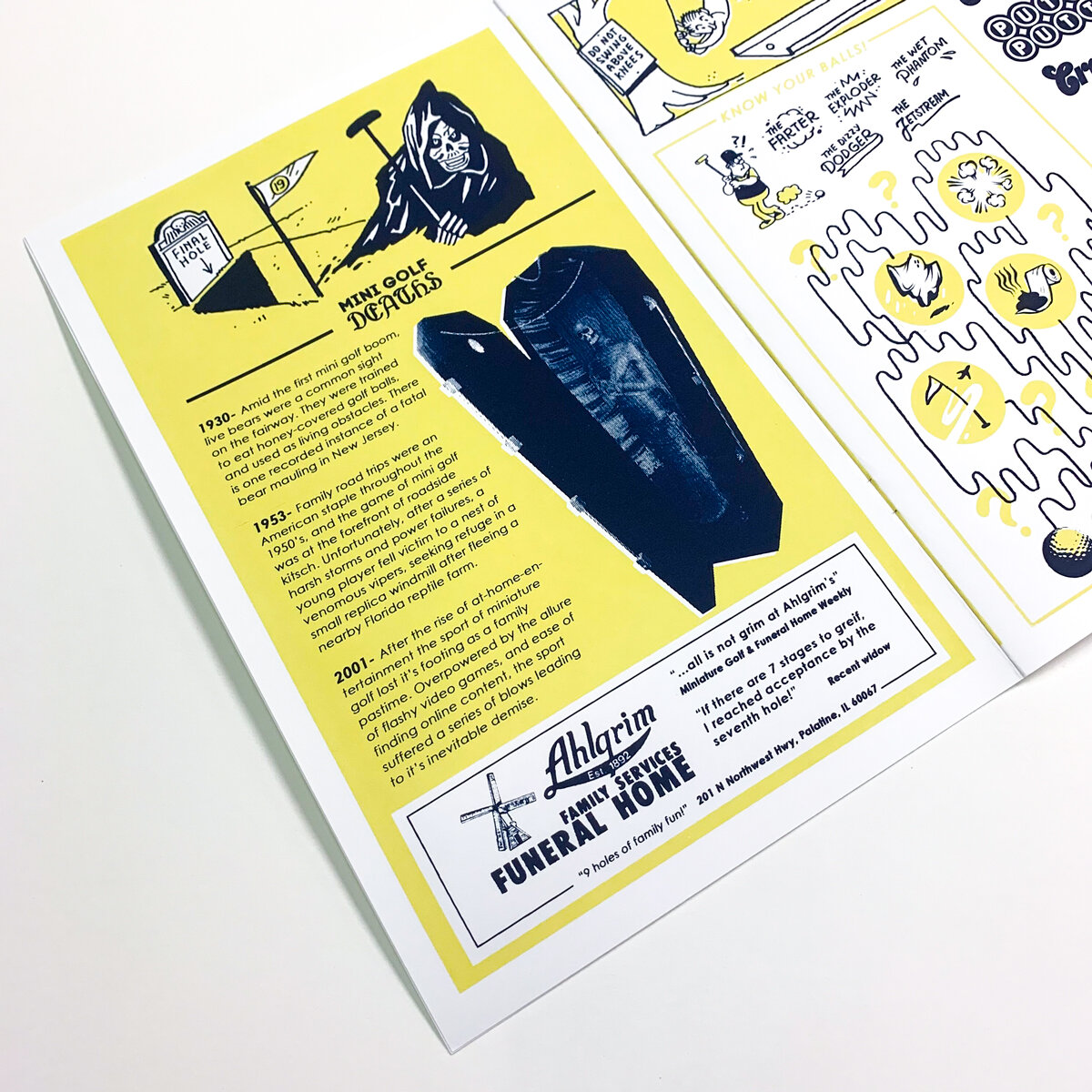
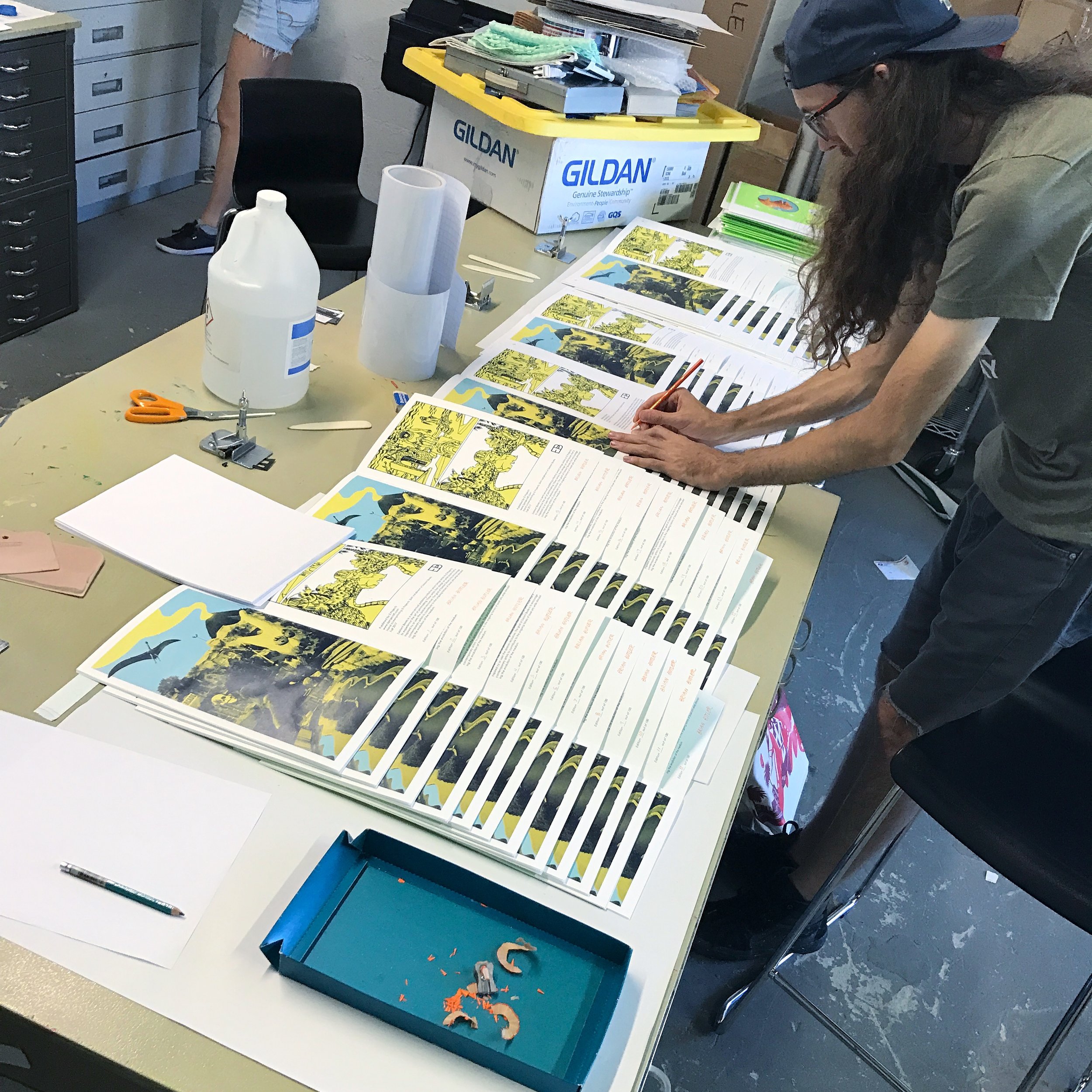
The Wonders of Mini Golf was produced at IS Projects in October 2017. It was released during the Small Press Fair Fort Lauderdale (SPF'17) on November 11th, 2017. The book was screenprinted by hand and die-cut on our Vandercook No.3 . The die cut hole on the cover turns the book into your own game of mini golf when the zine is laid flat. The zine consists of 16 pages of images, facts, activities, and illustrations by Brian Butler. The zine was printed in an edition of 100 and all books are numbered and signed by the artist.
Spring 2017: Jen Clay Nearing
Jen Clay is a multi-media artist living and working in Fort Lauderdale, FL. Using a variety of media including video, installation,and performance, Jen Clay constructs narratives that investigate fear and anxiety through recreations of common horror entertainment tropes. Her work is inspired by the playful aesthetic of educational children’s TV shows which can be seen in her use of stop motion animation, overly embellished costumes and puppets that speak directly to the audience. Jen Clay received Best Emerging Artist 2016 award by Broward New Times, Knight Arts Challenge Award for Interactive Initiatives, a non-profit founded by her and her husband Samuel Lopez de Victoria and was recently award the Cultural Investment Award by Broward Cultural Division.
From Jen:
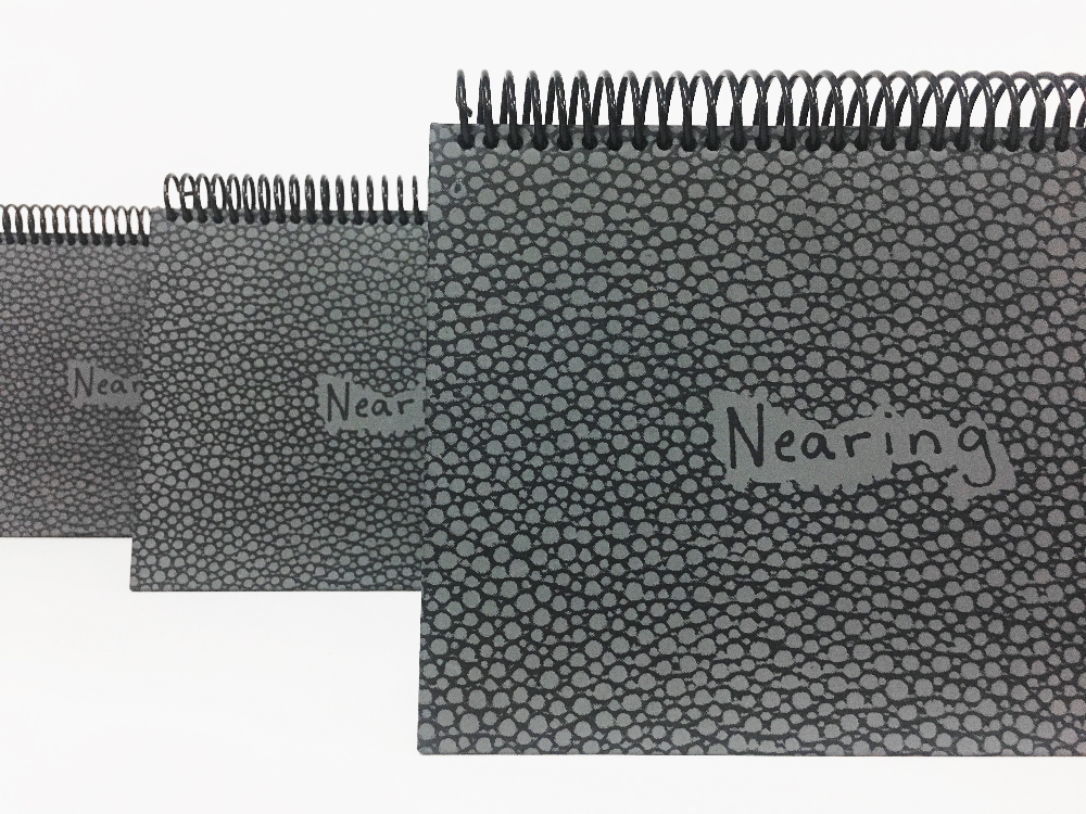
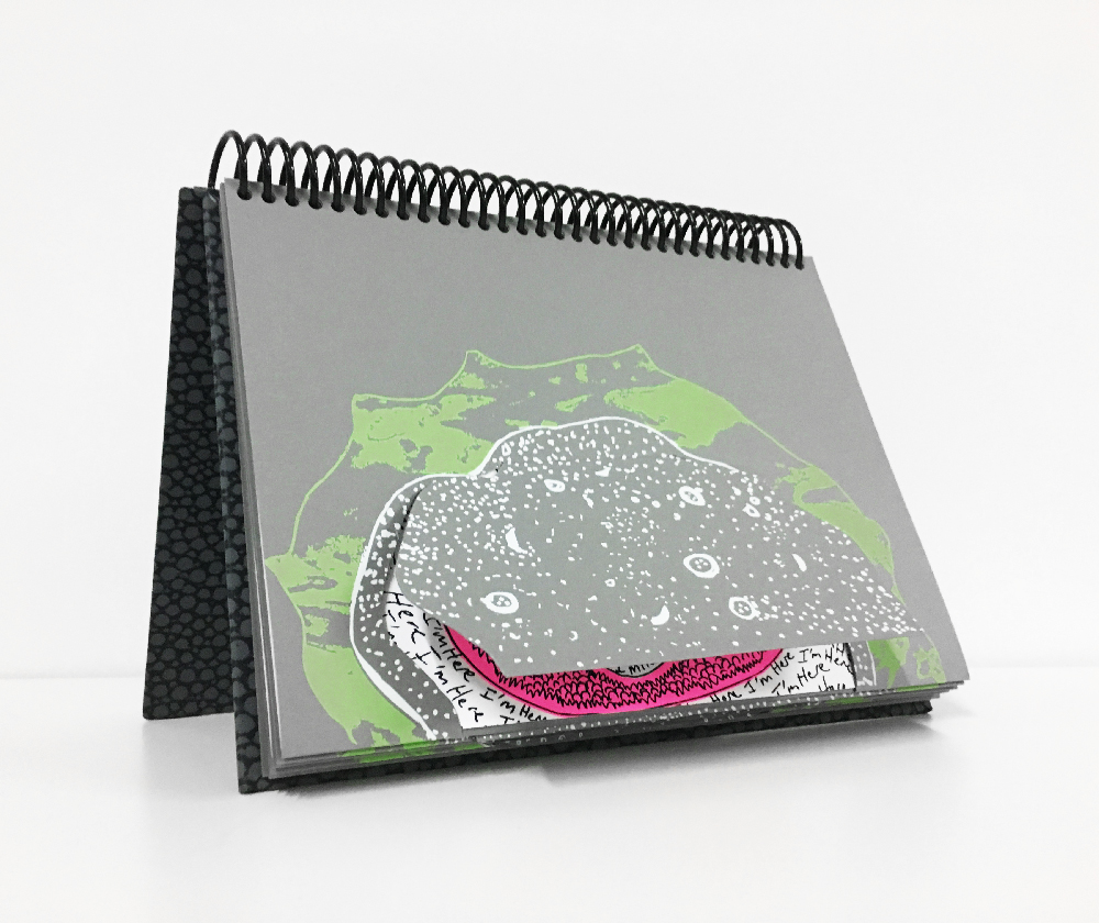
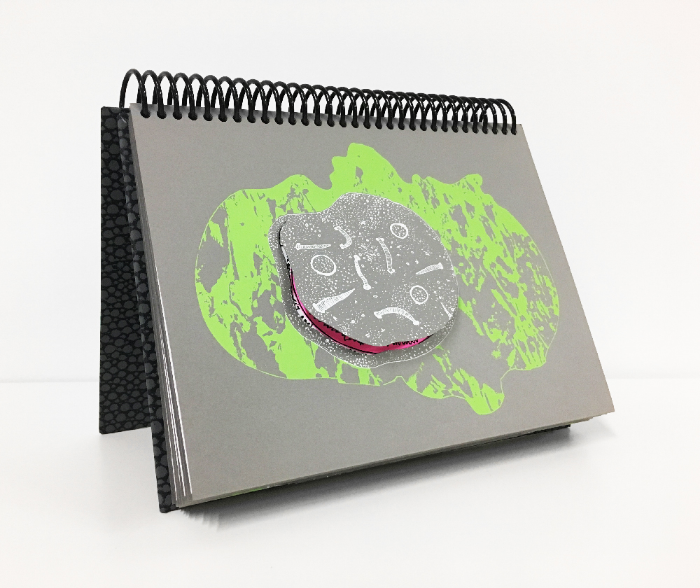
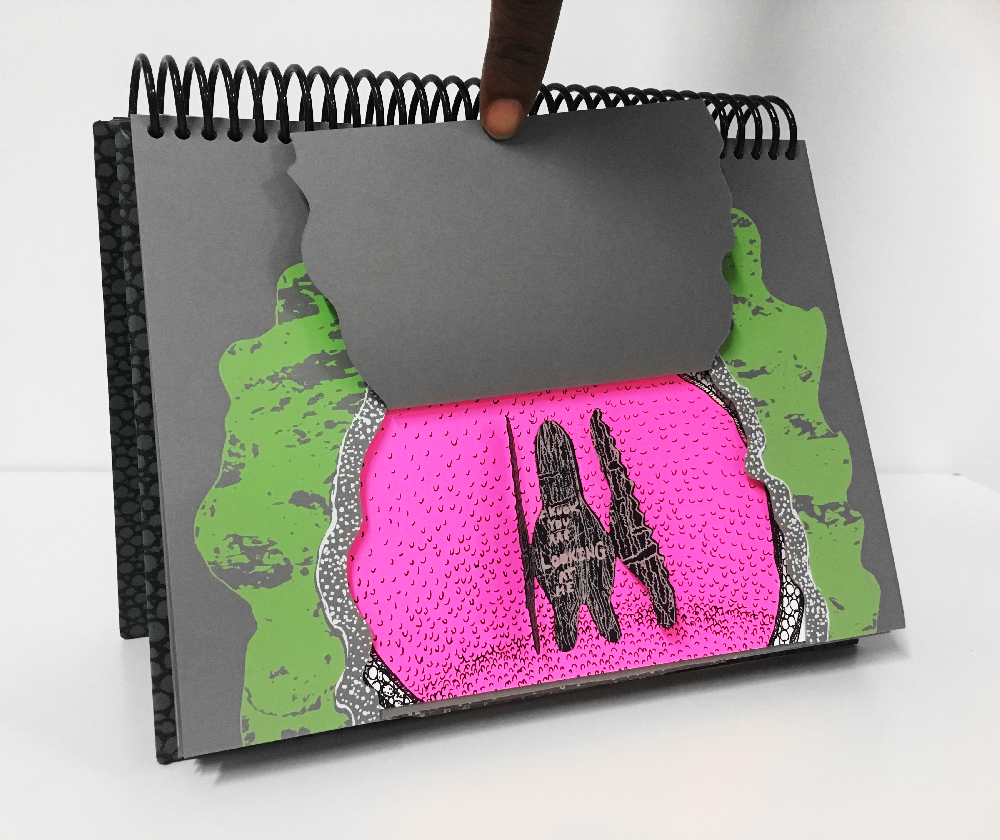
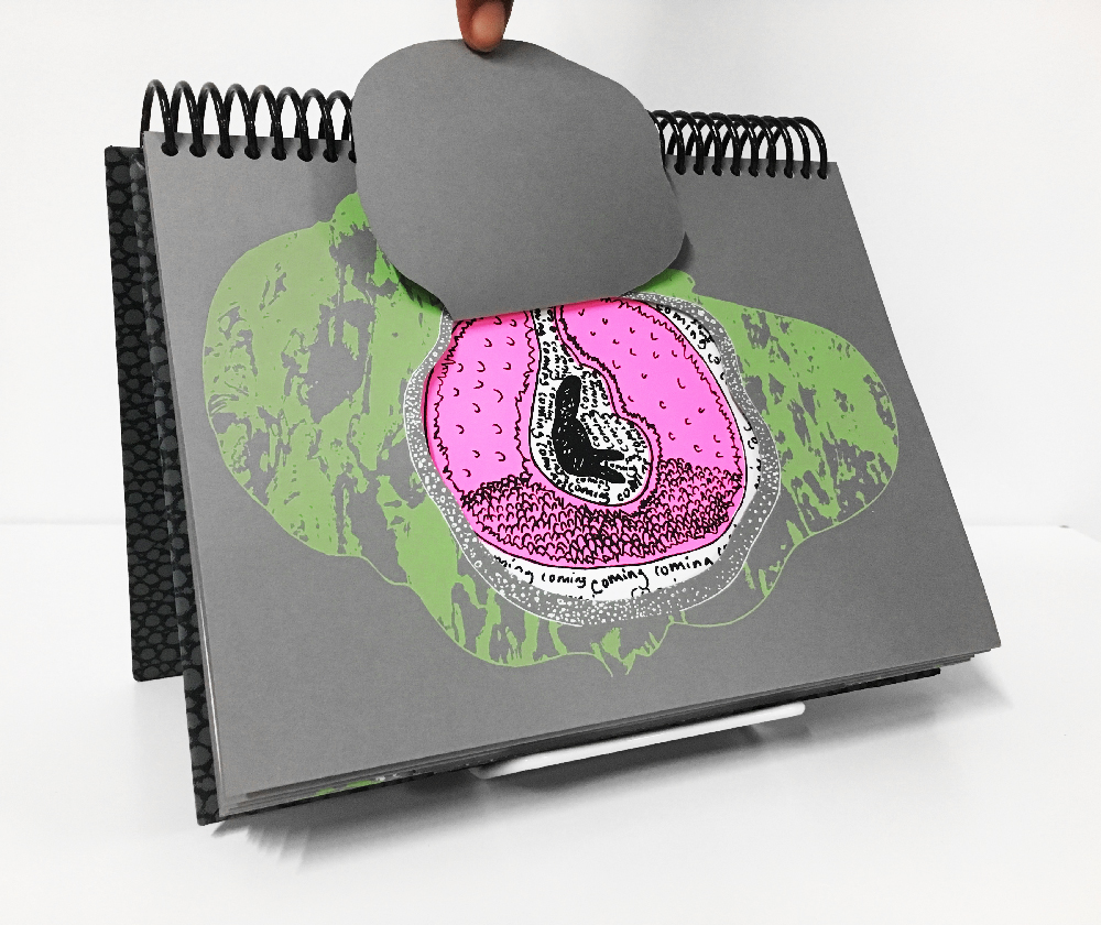
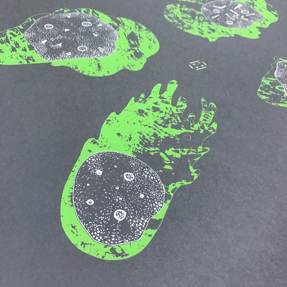
"I wanted to create an intimate experience for the book reader similar to the experience of seeing one of my videos or performances. This scenario is based off of actual unexplained events called Mothman sightings in Ripley West Virginia during 1966-1967, and North Carolina’s Brown Mountain Lights on going phenomenon. Like most my work, the viewer is meant to have a personal encounter with the unknown, usually manifesting as a seemingly friendly creature. Bright colors and bulbous shapes create an atmosphere of child-like dreaminess which is interrupted by implications of something more sinister. Nearing depicts an unknown-being’s growth while it expresses it’s obsession with the reader. The unknown creature’s excitement escalates as the meteor comes nearer and either fills its body or the atmosphere of the womb-like interior of the meteor."
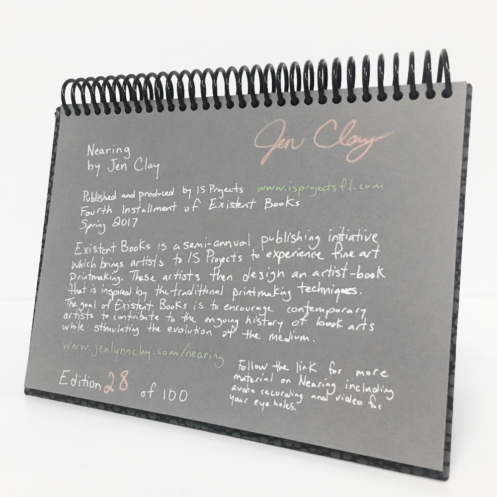
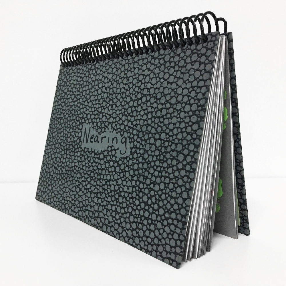
Nearing was screenprinted by hand during April 2017. The pop ups and fold outs were cut using a Cricut home plotter. The spiral binding allows the book to stand up like a miniature stage allowing the reader to interact with the piece as a performative object as well as a book. The book consists of 18 pages with pop ups, cut outs, and fold outs. Nearing was printed in an edition of 100 books all signed and numbered by the artist.
Fall 2016: Noah Levy $WAPSHOP
Noah Levy is an artist, illustrator, and designer based in Miami, Florida, where he works as a freelancer under his agency, OMIT Studios. Originally from Detroit, Noah studied at the College for Creative Studies and collaborated with international artists like Revok and Katsu Since moving to Florida in 2013, his artwork has been exhibited in galleries such as WYN317 and WORK Gallery in Miami, and The Scarab Club in Detroit. His latest collaborative book, ‘Arty Gras,’ was featured at Design Miami. Noah has recently completed large commissioned outdoor mural projects for Whole Foods Market and The Freehand Hotel.
From Noah:
Attending flea markets and antique shows was routine as a kid. My parents would visit these types of places while road tripping to Northern Michigan or vacationing in Florida. I was instantly hooked onto the idea of collecting and finding treasure from another person’s junk. My favorite items were old zippo lighters, enamel pins, lanterns, and war memorabilia.
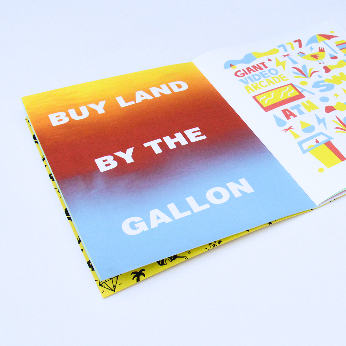
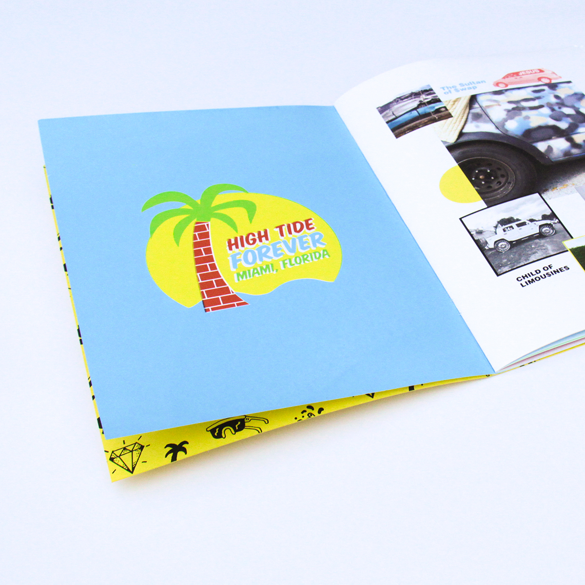
As I got older, my desire to collect objects was replaced by a passion to collect experiences. The Swap Shop delivers a variety of both. Therefore, documenting my experience at the Swap Shop seemed like a perfect assignment. I consistently made my way to the giant flea market at least once a month for 3 years.
Part of the flea market experience is the people who attend them and the items that they share. There is no specific demographic of people who visit the Swap Shop. Young, old, poor, and rich souls wander around the giant parking lot (mostly) in harmony. The interaction between shoppers and vendors is balletic. The piles of colorful, thrifted clothes pouring out of trash bags is sculptural.
The goal of the Swap Shop book is to capture these inspiring moments through a variety of media including photography, collage, and illustration.
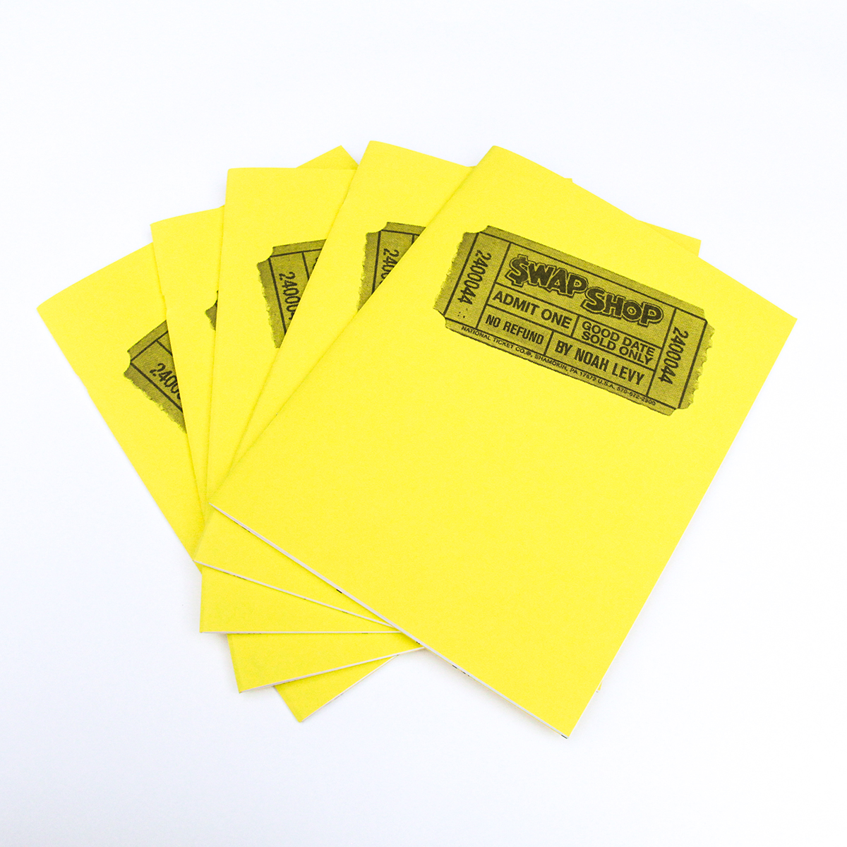
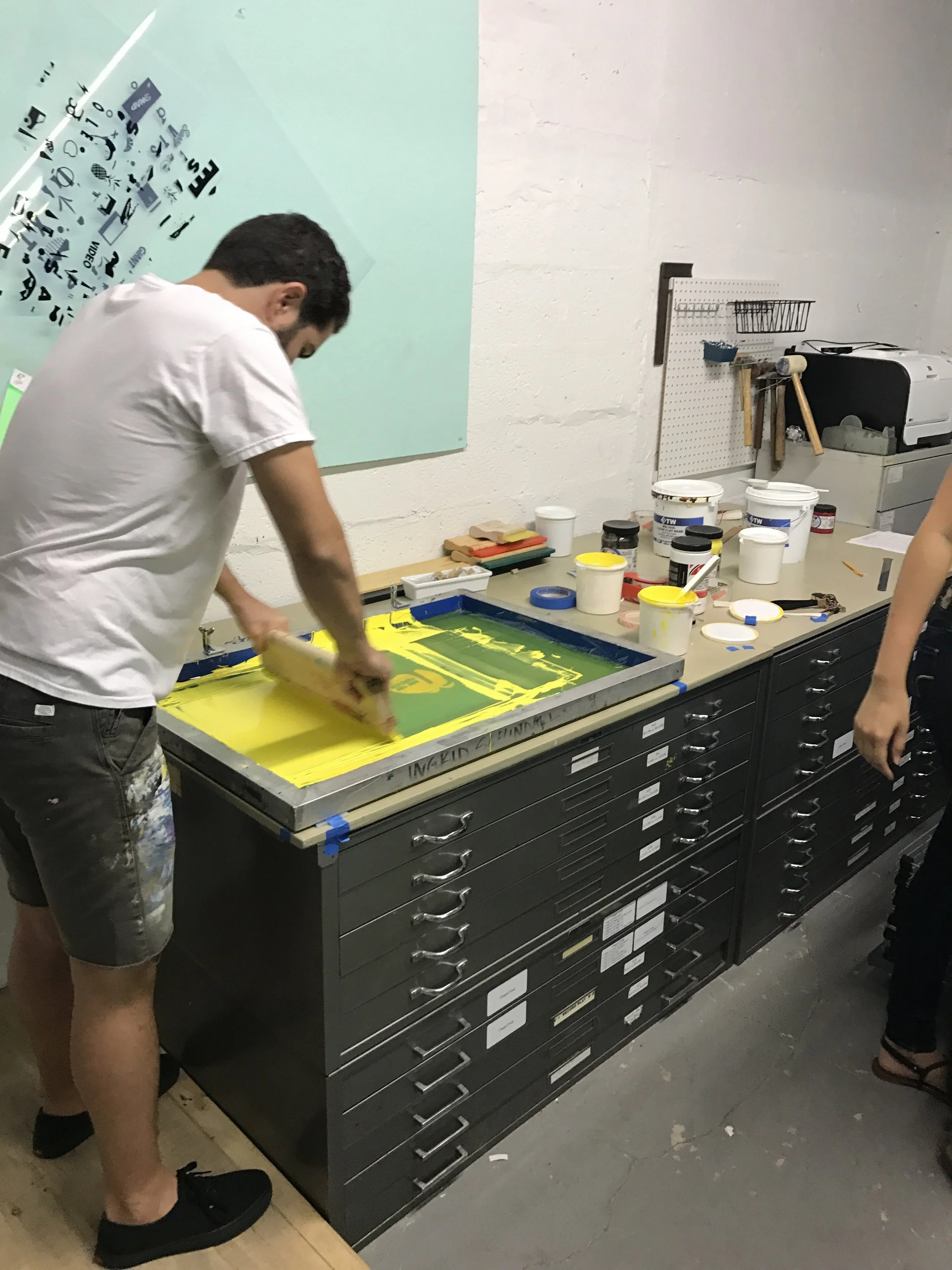
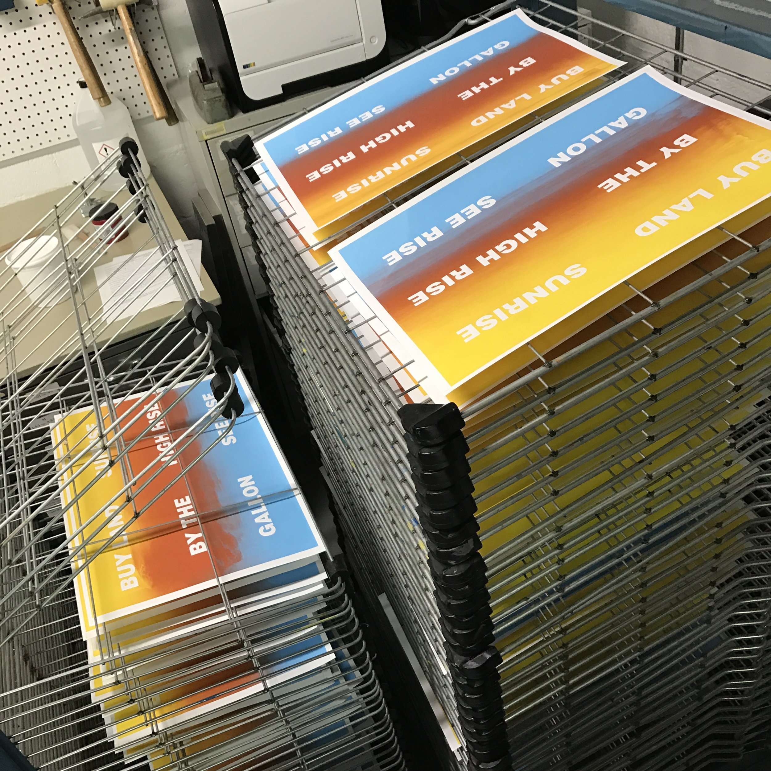
SWAP$HOP is a combination of digital printing and hand screenprinting with a letterpress printed cover. It's 24 pages incorporate Noah's different artistic practices in a playful exploration of illustration, photography, and narrative sequence. It was printed in an edition of 100 books all hand numbered by the artist.
Spring 2016: Elizabeth Sheehan Devoted
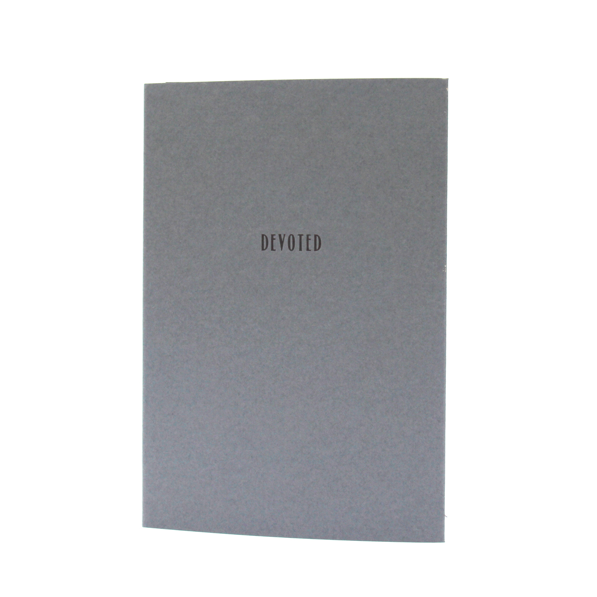
Beth Sheehan is a printmaker, papermaking, and book artist living in Philadelphia, PA. Her work investigates ideas of memory and perception to explore her own lack of episodic memory. Her work has been exhibited internationally and is held in public collections including the Metropolitan Museum of Art, The Center for Book Arts, and the San Francisco Public Library. In 2013, she was selected as a participant in Hand Papermaking Inc.’s 11th portfolio. She was selected as a Scholar at The Center for Book Arts, an Existent Books artist at IS Projects, and a Printer-in-Residence at the Newark Print Shop. Sheehan is currently a printer at Durham Press and teaches paper, print, and book workshops.
From Beth:
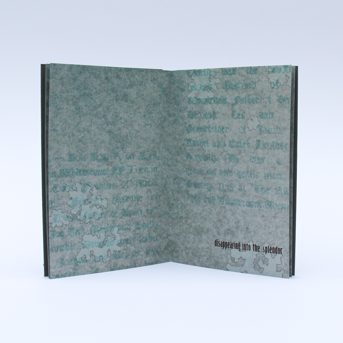
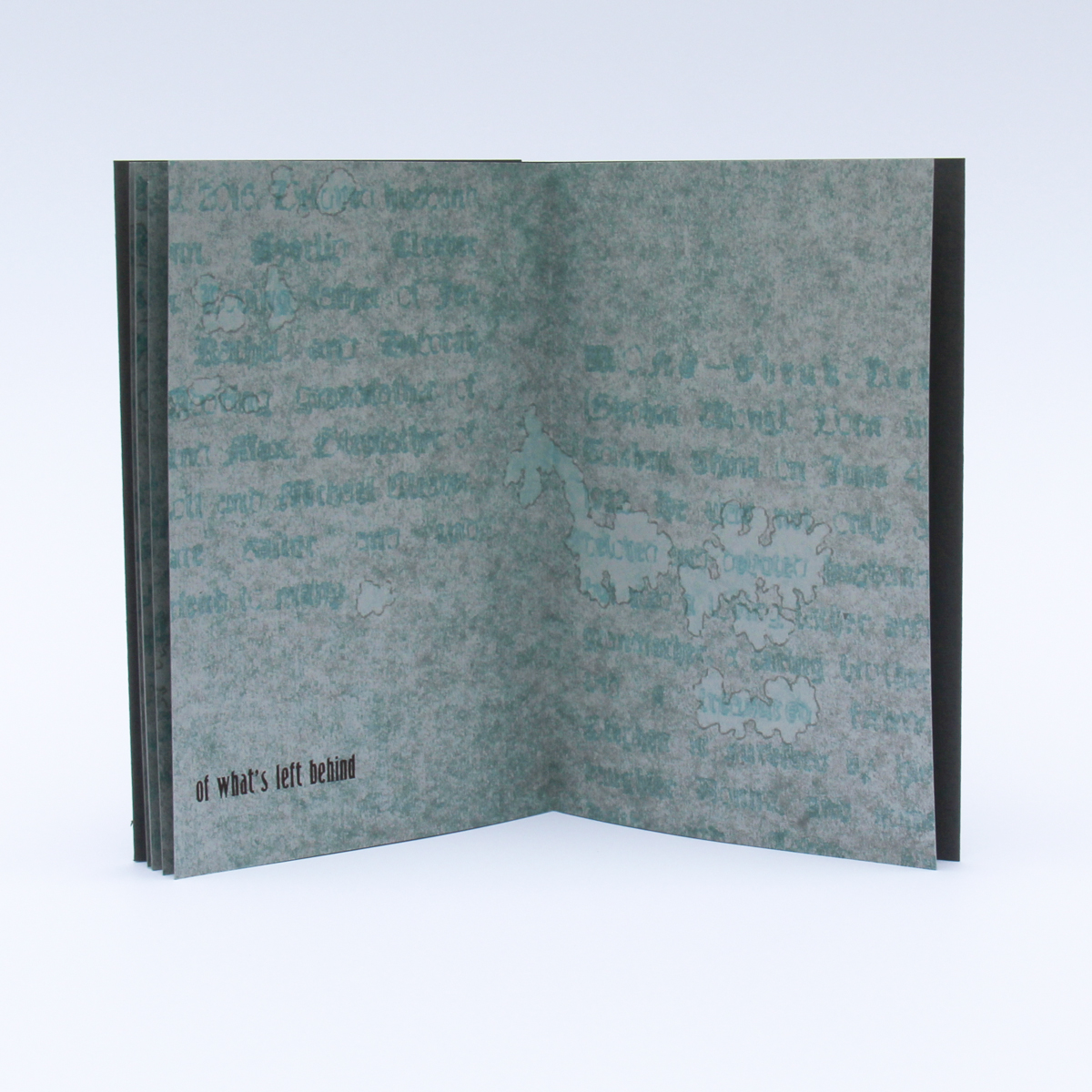
With so much of my past missing from my memory, I've become obsessed with the importance of remembrance and mementos. Being in Florida at IS Projects, I was constantly reminded of how much we rely on objects to hold our best memories. It is evident in the eclectic souvenir shops and fun tourist traps that are based on this idea, but it is also evident in so many other moments—the photo booth at FATVillage Art Walk, collecting seashells on the beach, and even being given a marble and learning of the memory the giver attributed to it. We are constantly collecting mementos that capture the beauty of a moment in time. These mementos become our monuments to the best parts of the past.
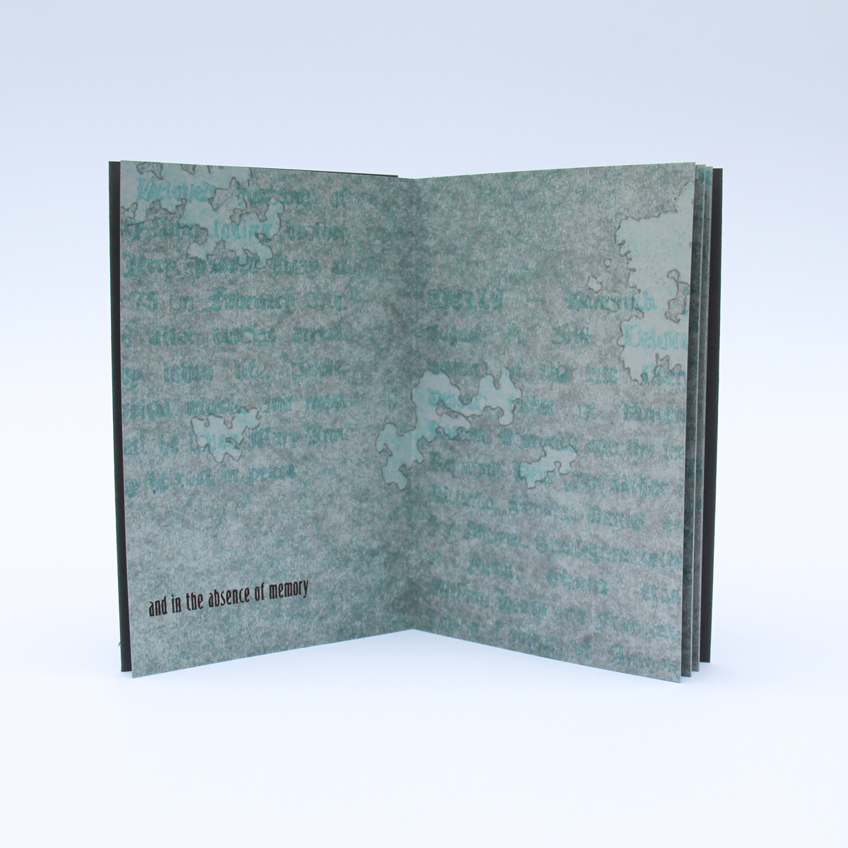
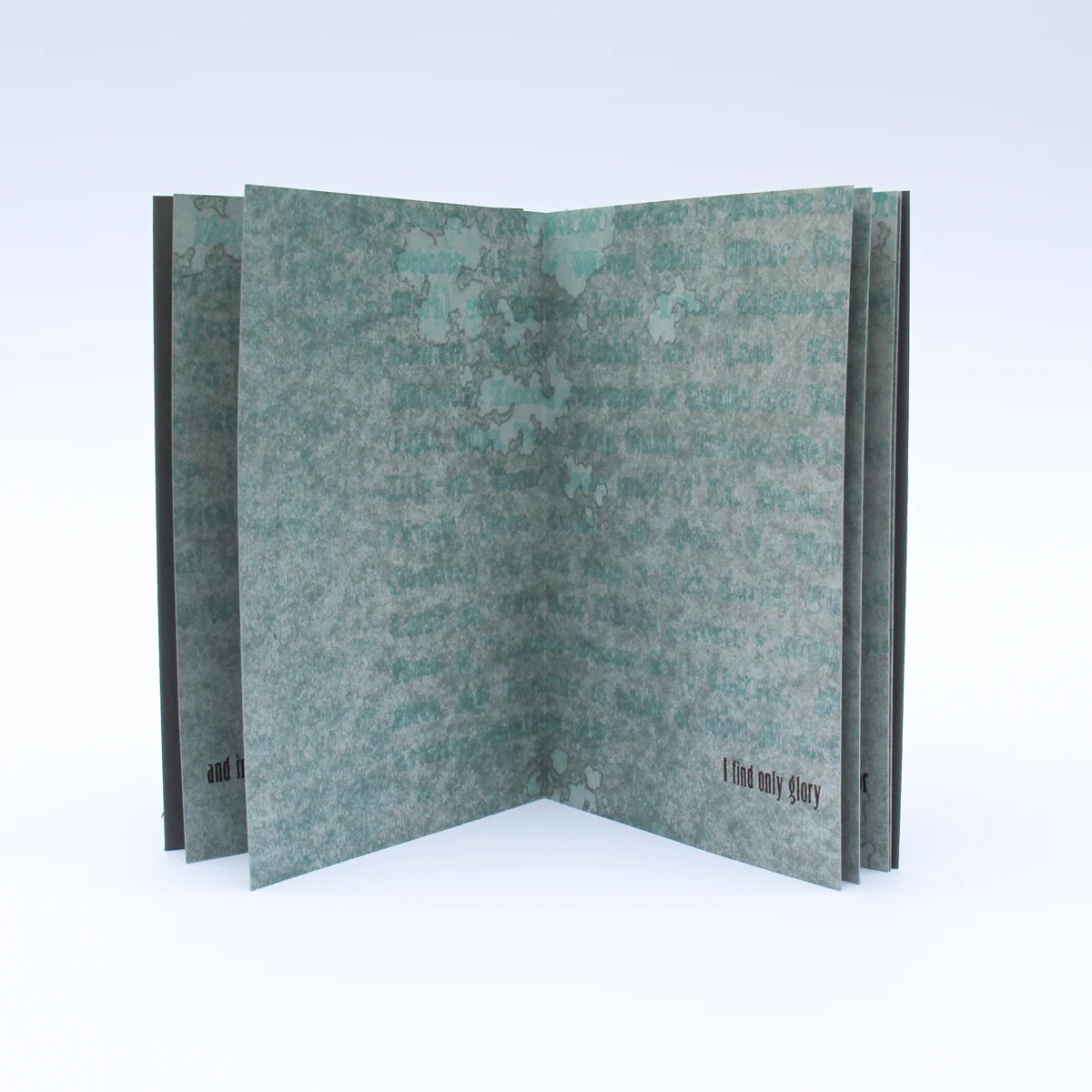
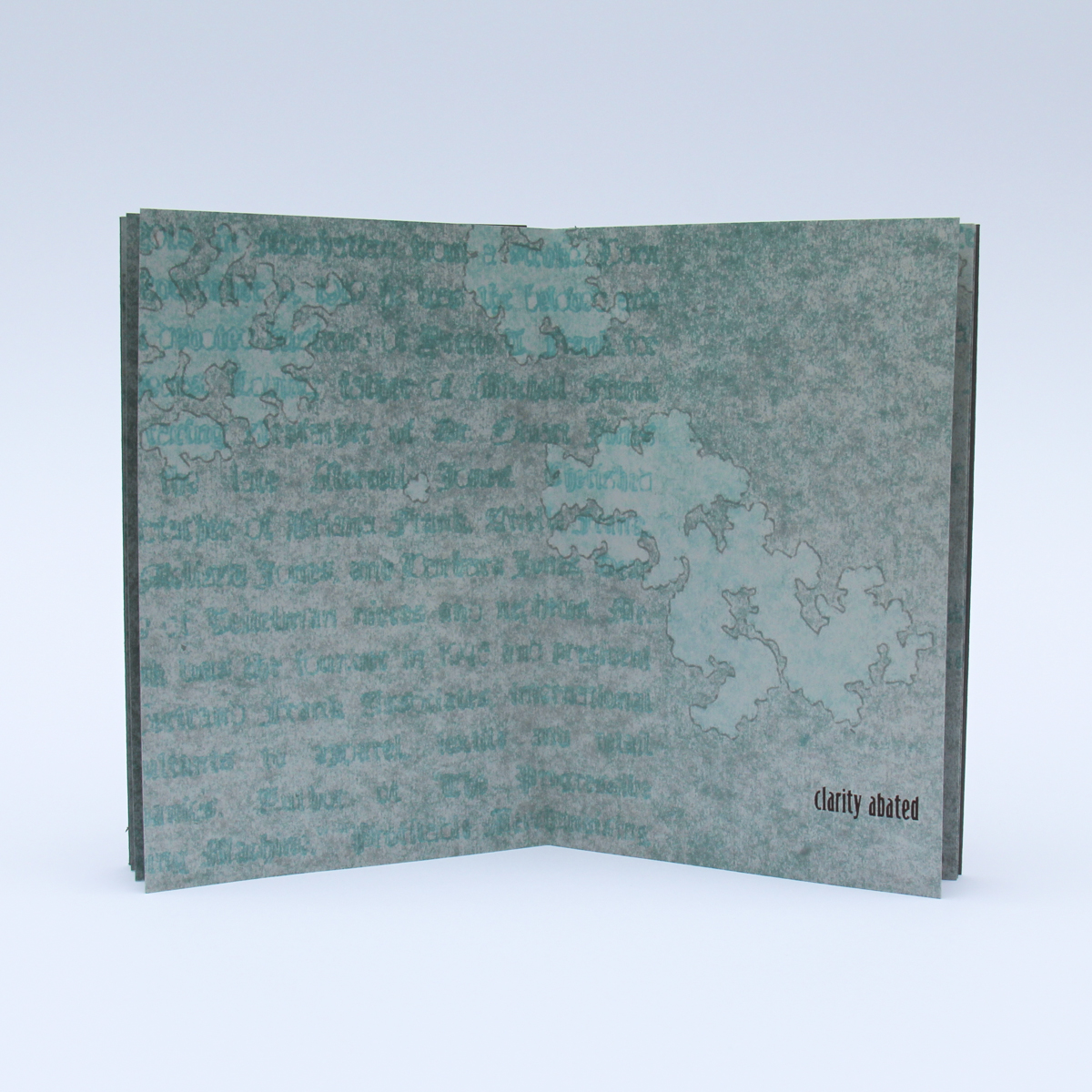
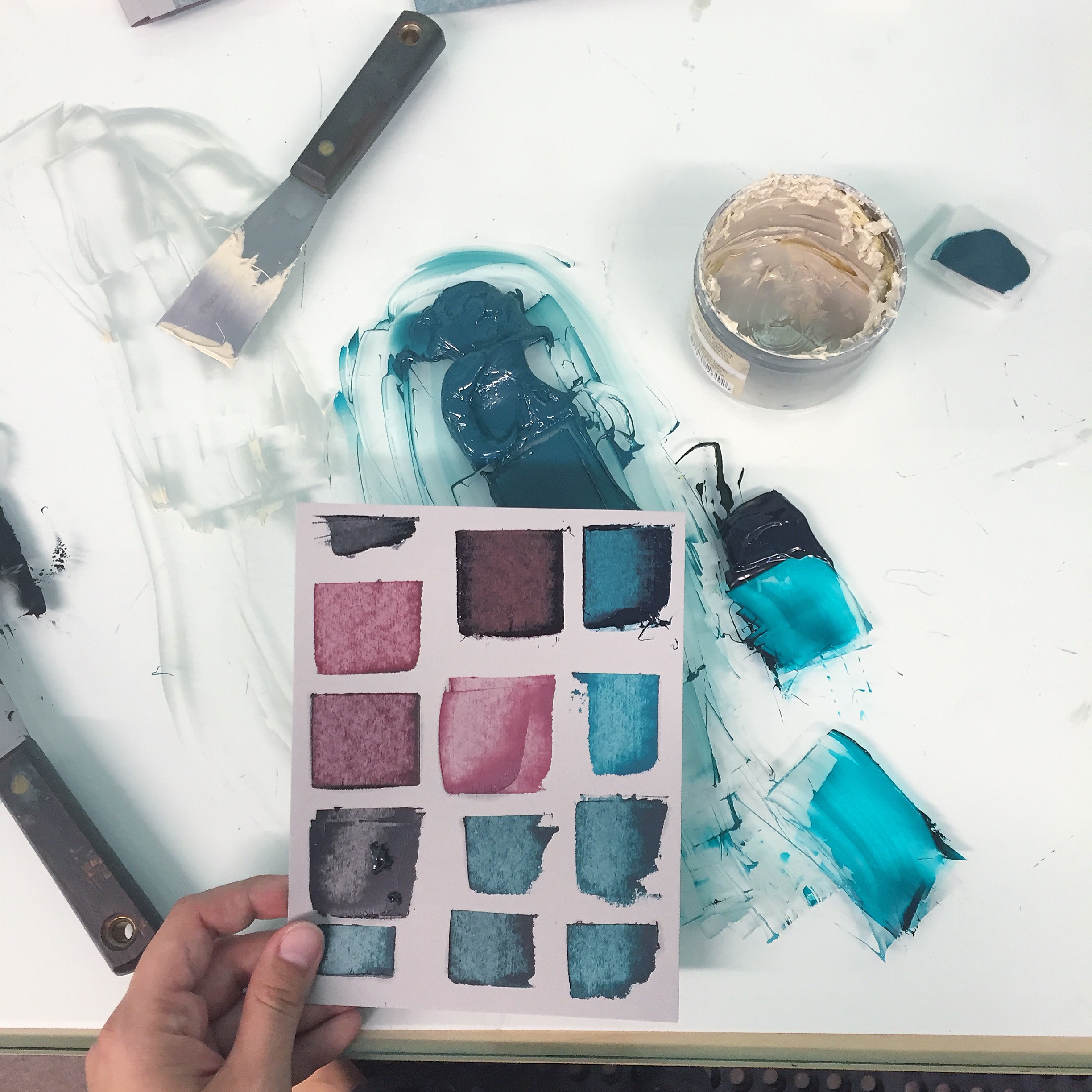
For this book, I turned to words as mementos and considered the effect that the passage of time has on our memories. Text taken from obituaries reflects on the greatness of one's life using words that become monoliths: beloved, devoted. This text was pressure printed as the first layer of the book. The lichen printed overtop references the blurring effect that time has on our memories, leaving only certain moments unobscured. Finally, the text letterpress printed as the last layer is my response, allowing myself to succumb to the glorification of the past and accepting the flaws of recollection.
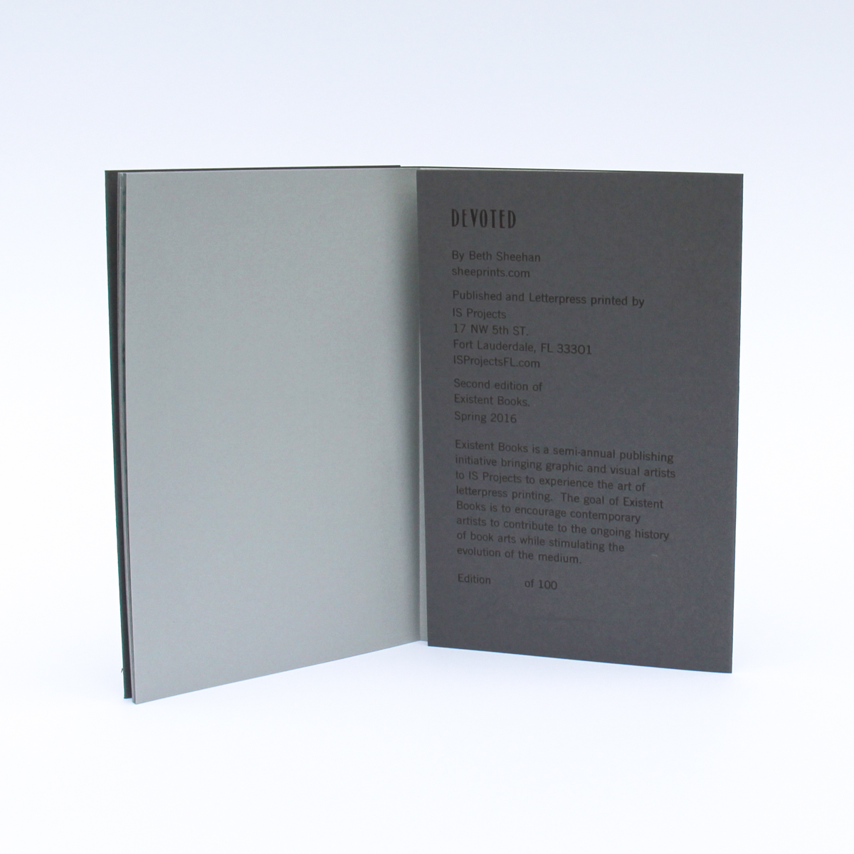
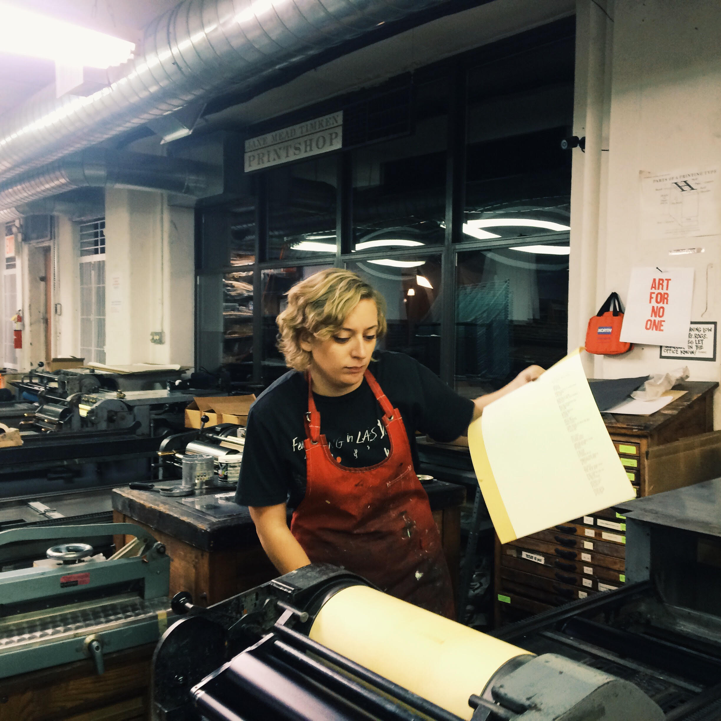
Devoted was letterpress printed on our Vandercook SP15 from hand burned pressure plates, prepared by Beth, and handset 24 point Spire lead type. The book is printed on Colorplan 70# grey paper and a 130# Colorplan grey cover. We used the drum leaf binding technique so the book opens completely flat with no disruption of the image. It is a limited edition of 100 copies all hand signed and numbered by the artist.
Devoted is available in our shop >
Fall 2015: Edau Disarray
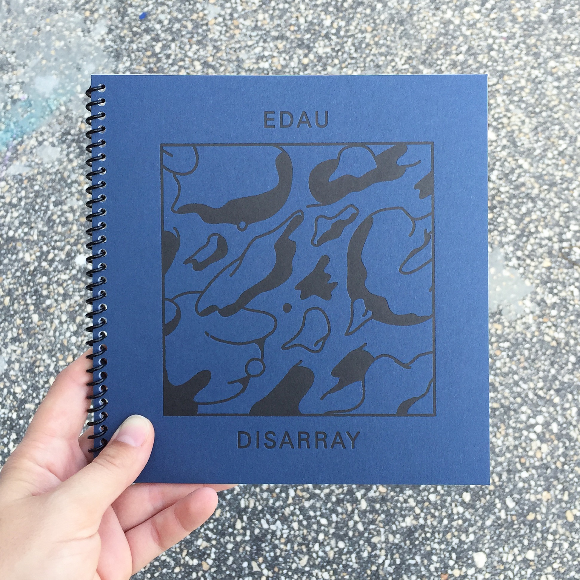
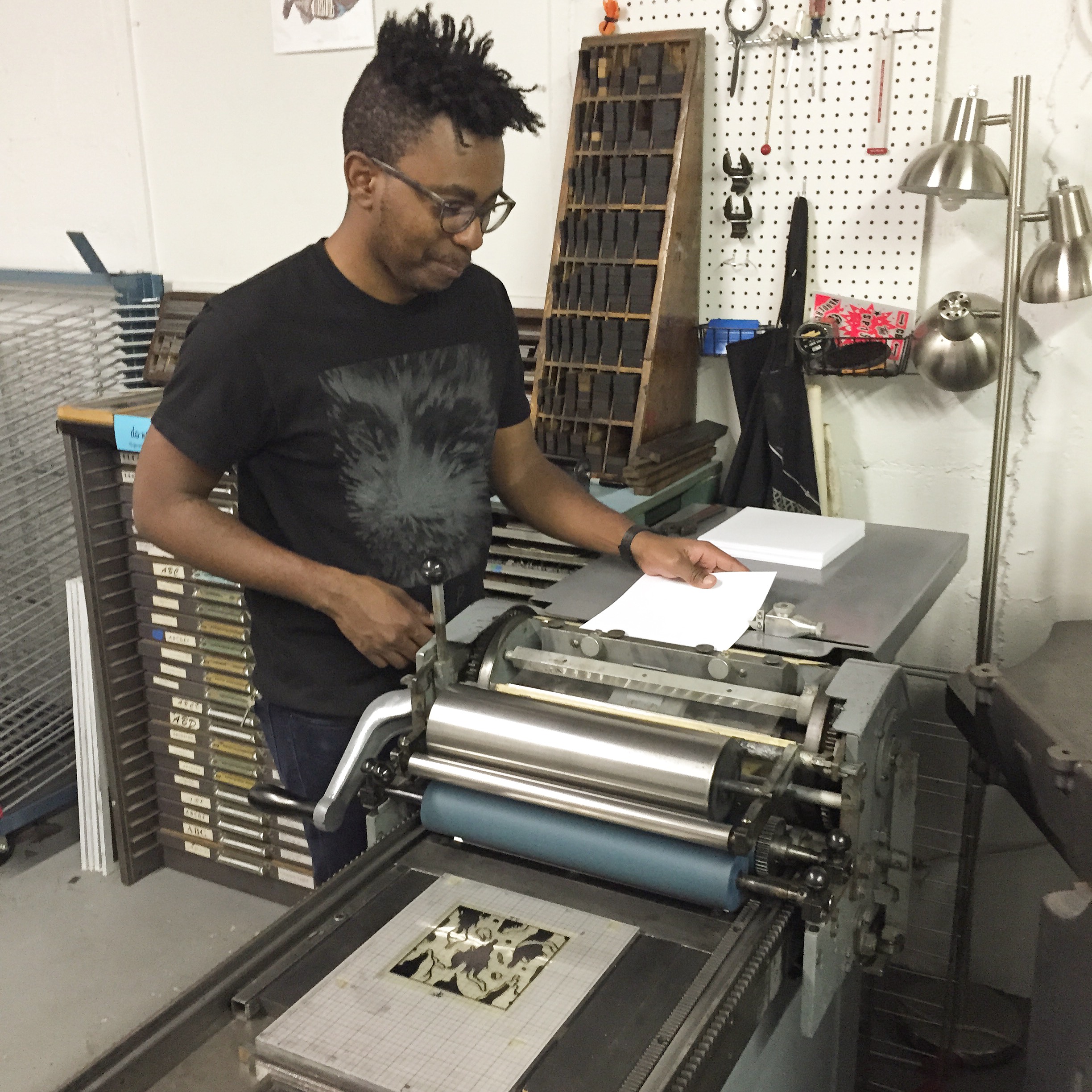
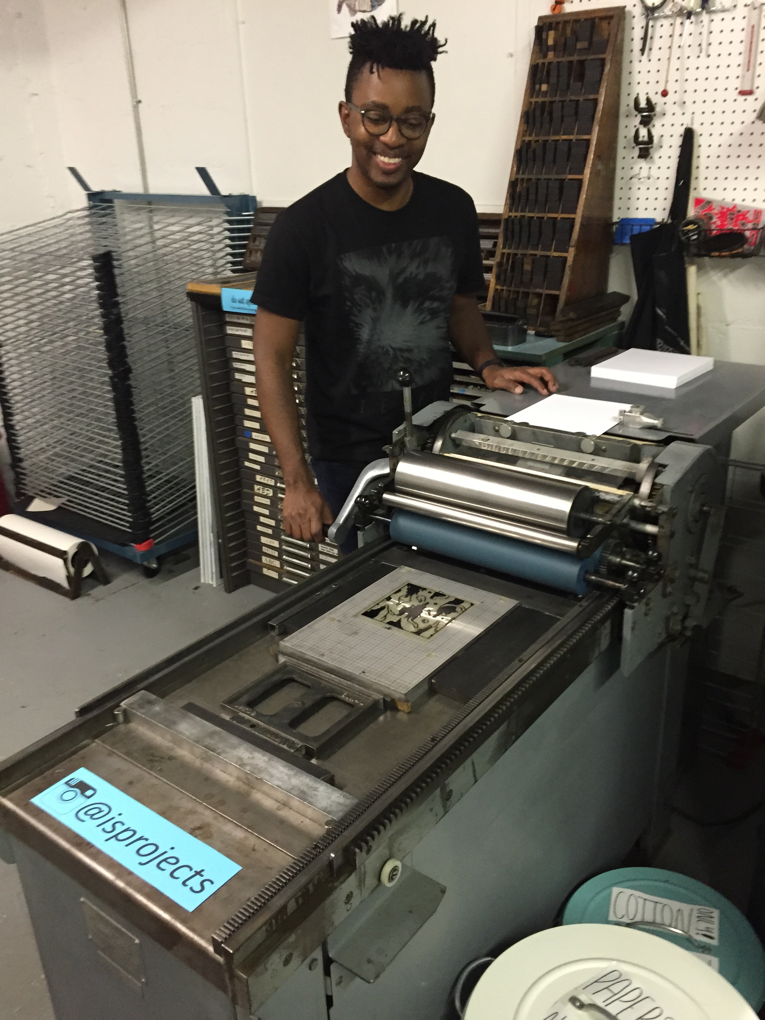
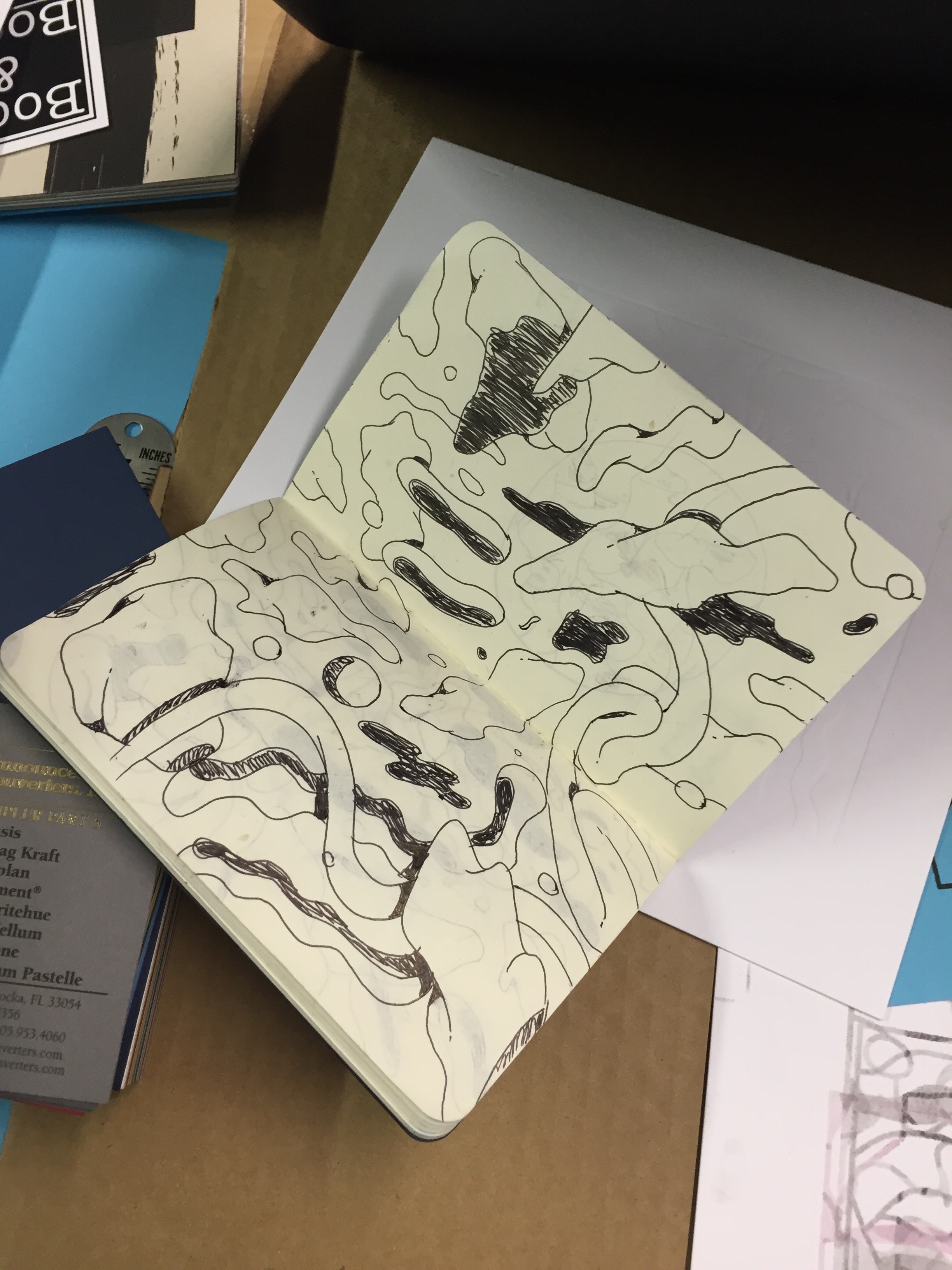
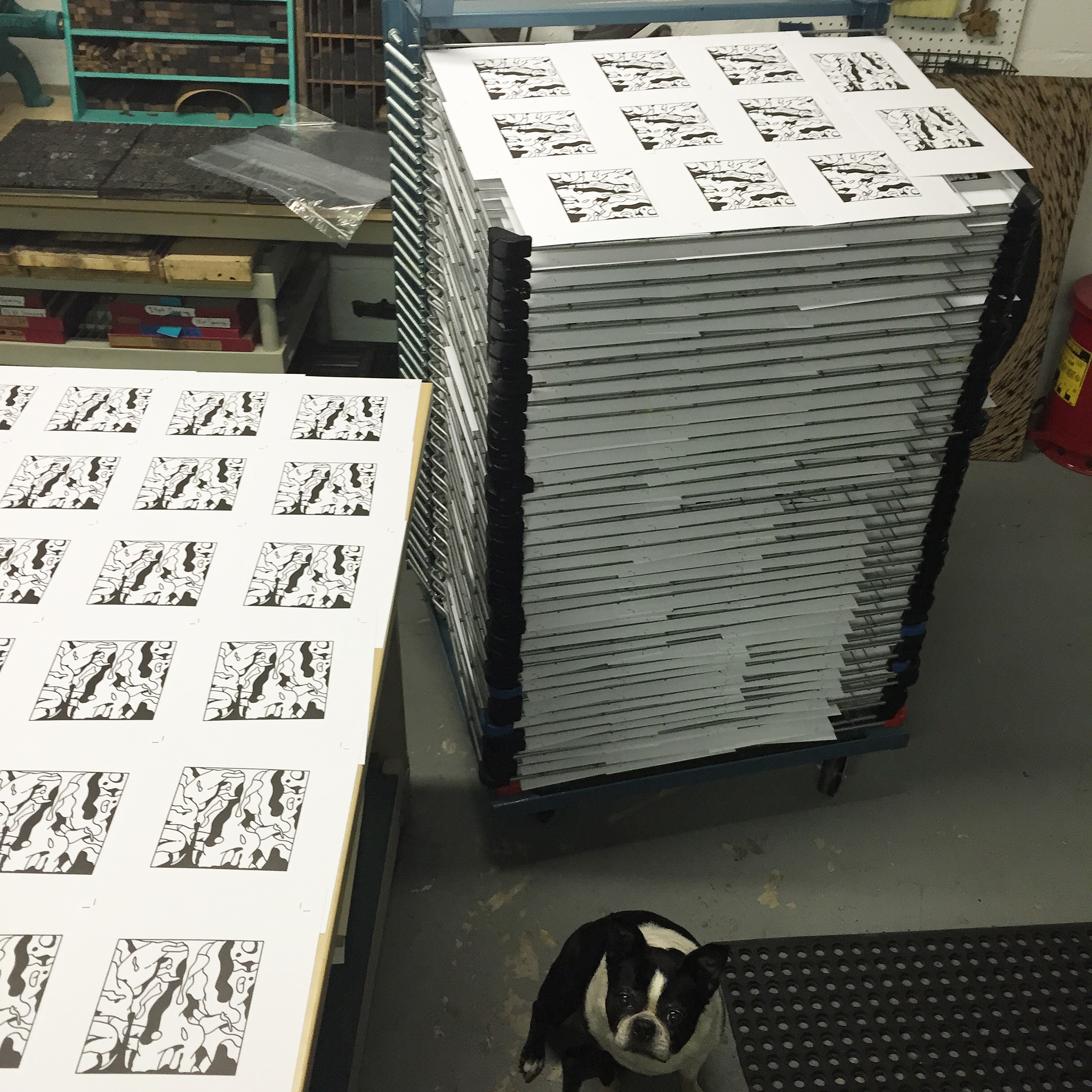
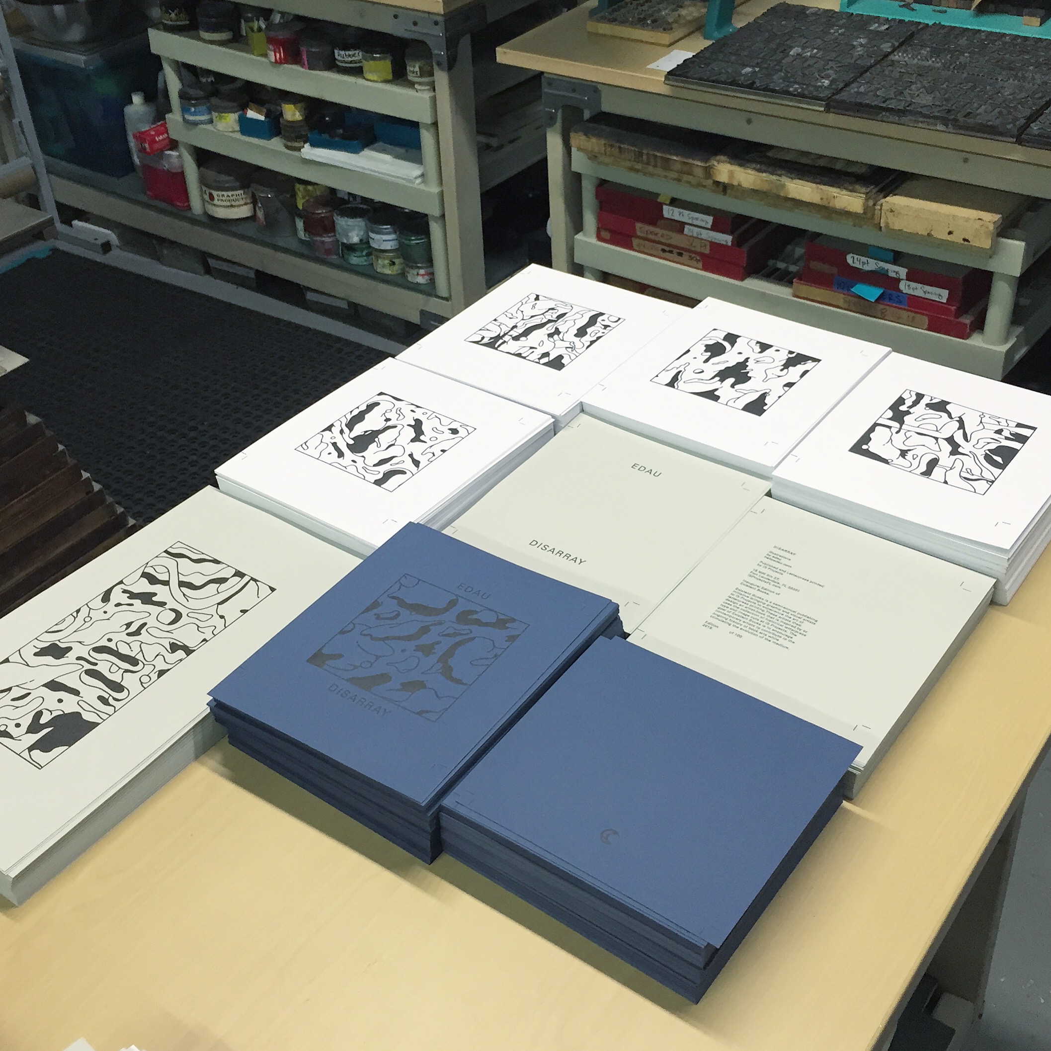
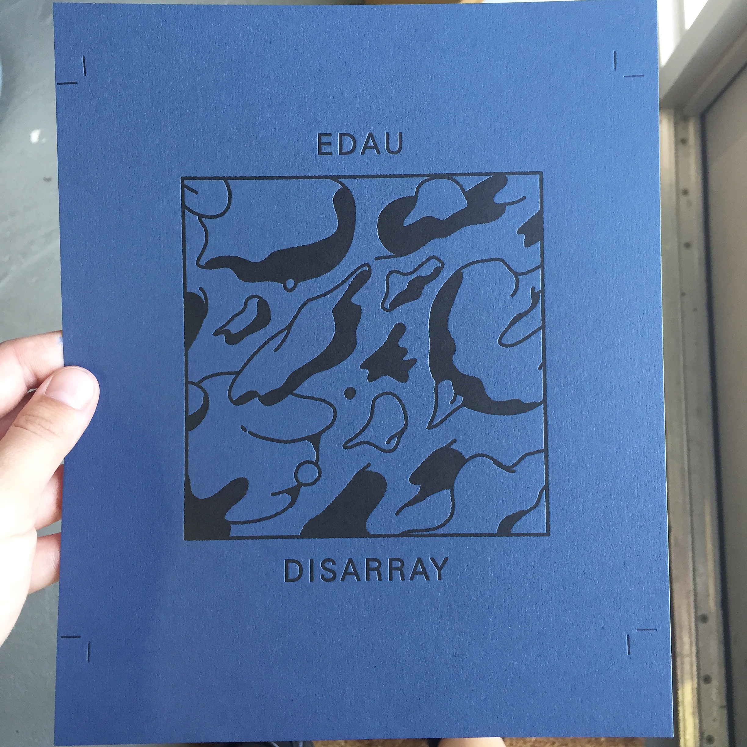
Edau, a Miami-based illustrator and graphic designer, was selected as the inaugural artist for the Existent Books publishing initiative. He was excited to learn the process of letterpress printing and drew inspiration from our collection of vintage lead typefaces and his illustrative visual language to create Disarray, the inaugural edition of Existent Books.
From Edau:
"The series of illustrations featured in this book are based on an old sketch that I had created months back before the project was conceived. I happened to revisit the sketch during the time I was trying to decide on which direction would benefit my collaboration with IS Projects (via letterpress printing) the best. Once I made my decision, I started to make different illustrations for the series. I took a few elements of the original sketch (which the cover illustration is actually based off of) and expanded on them. In turn, I decided to push myself with each illustration to create something that was visually complex and interesting, yet hard to decipher. As a result, the title of the project, “disarray” was conceived. Some illustrations were pushed more than others to show different ways the concept of disarray could be achieved within the realm of this project."
Disarray was letterpress printed on our Vandercook SP15, using photopolymer plates, onto Colorplan Cobalt 130# cover, Springhill Grey 110# cover and Cougar Opaque White 130# cover then spiral bound in our very first spiral binding adventure. It is a limited edition of 100 copies all hand numbered by the artist.
Disarray is available in our shop >


